Funimation
Anime has been a way for me to find inspiration and support since my childhood. I use the Funimation app to watch my favorite shows. I grew up watching shows like One Piece, Naruto, and Bleach on my television and today continue to do that via their mobile app.
As a UX designer, I found a few areas in which they could improve their user experience.
Problem Discovery
I started this project, by listing out the problems I had discovered during the last year of me using the app. Through a quick analysis of my thoughts, I was able to realize, I was most concerned by the home screen, browsing, and video player experience. Below is a glimpse of some of my initial thoughts.
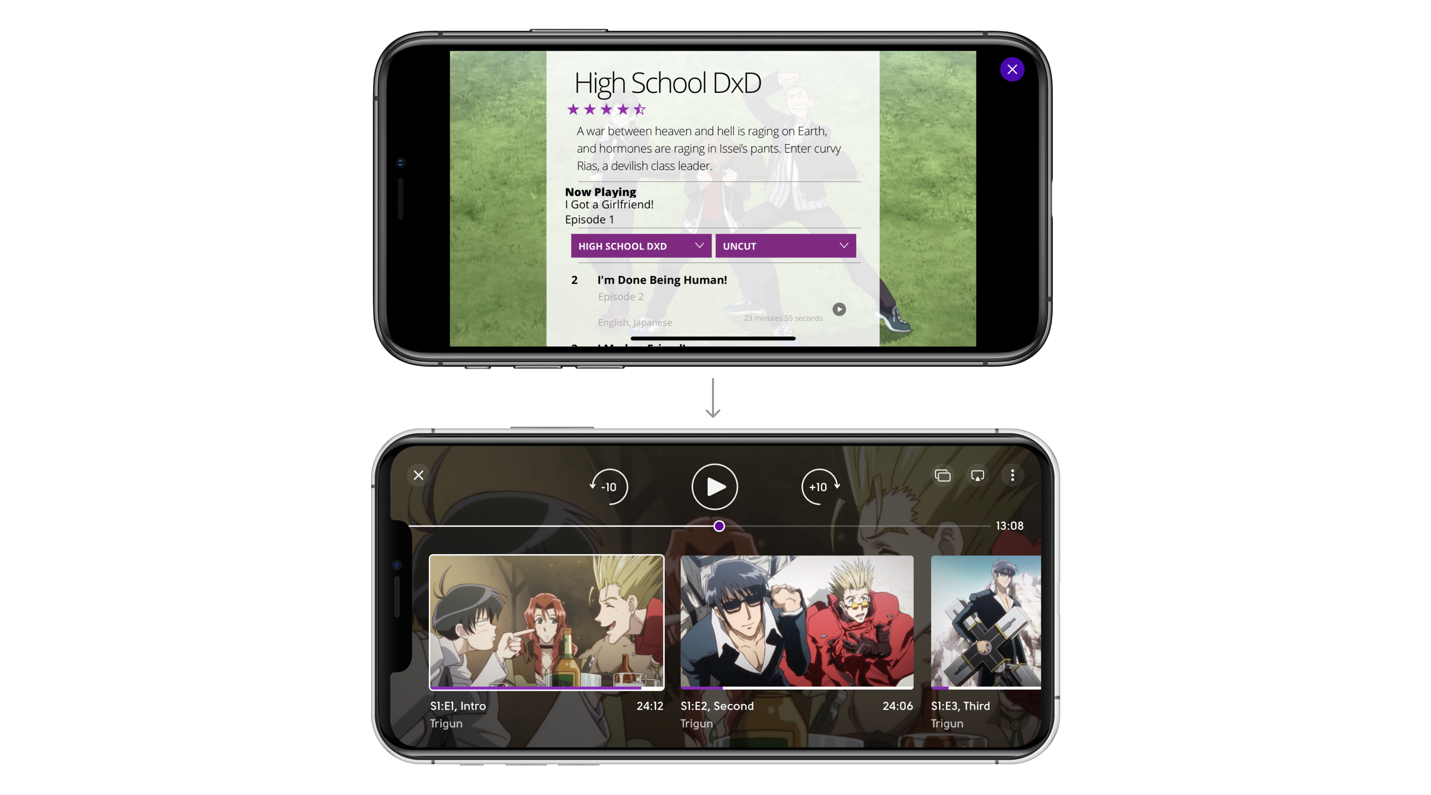
The Next Episode, Skip Intro
An opportunity to move to the next episode, skipping credits. I often watch a few episodes in a row, so repeating credits are frustrating, even though the music is usually good.
This small improvement in addition to auto-play of the next episode and skipping intro will increase member engagement with the service.
Clear Continue Watching Row
I like to browse different shows, but after previewing they go to the “Continue watching” row. And even if I don’t want to watch these shows, it follows me into the main section of the home screen.
A small option to hide the series from the “Continue watching” row will increase member speed of finding actual content, and ultimately member retention.
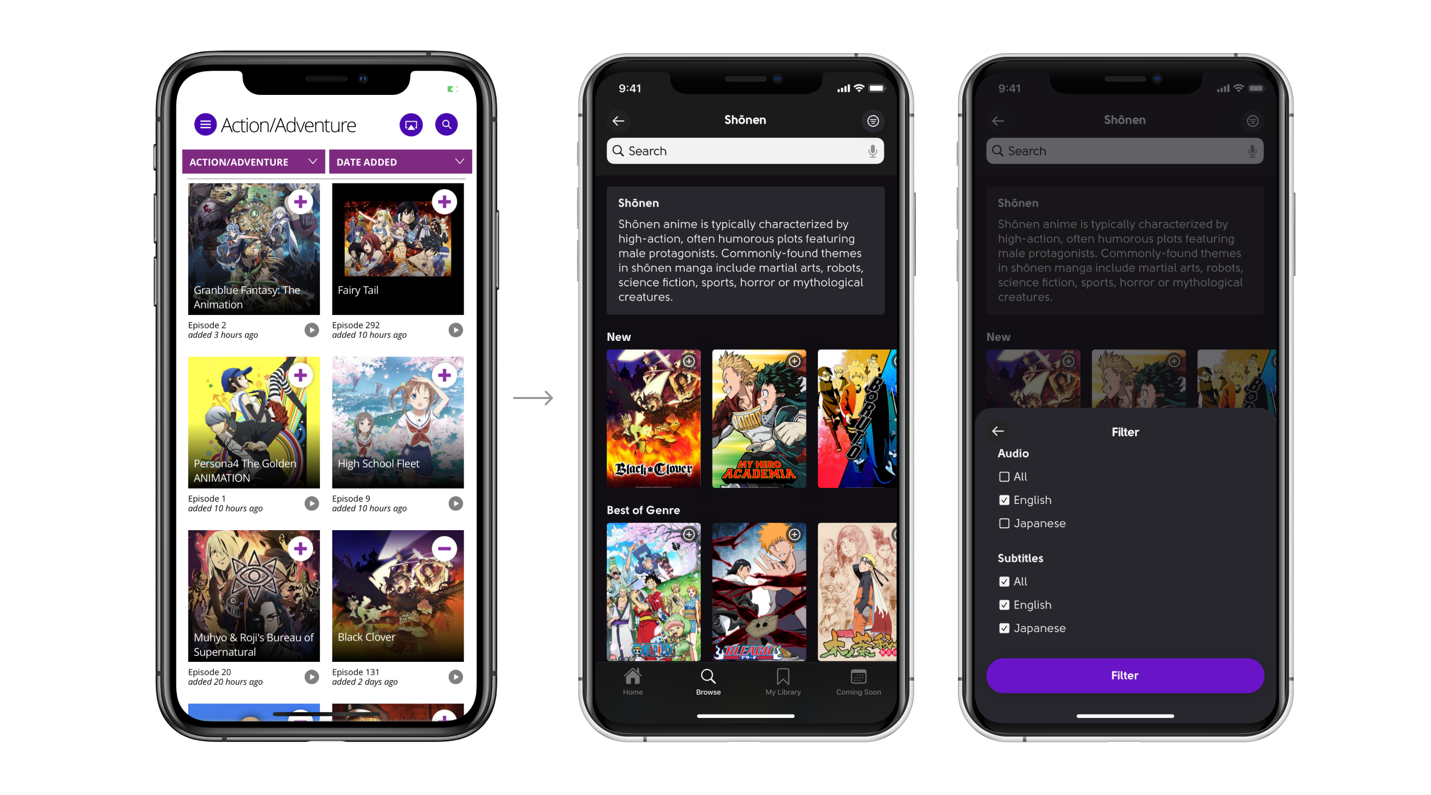
Filter by Language
Also, it is hard for me to watch anime in Japanese, so usually, I choose dubbed one.
Filtering anime by subs/dubs will also increase member speed of finding actual content, and ultimately member retention.
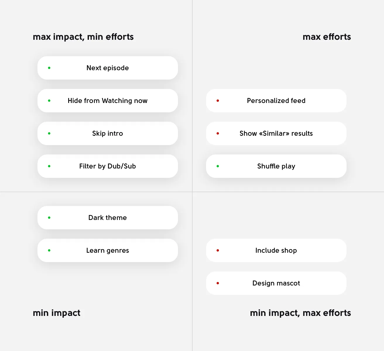
Prioritization
As mentioned above, I had discovered multiple issues. Rather than trying to solve all, I prioritized to design for the most important issues plaguing the app experience.
Spying on Competitors
I examined a variety of comparative experiences: Netflix, Amazon Prime, Crunchyroll, and Spotify. I discovered that Netflix had a great video player and personalization mechanics, Crunchyroll offered a fantastic language and subtitle filtering experience, and Spotify leveled up the search process, offering genres and mixes before the user even started the search process, etc.
The Video Player
The Video Player is where people spend the most time in the app. Unfortunately, though, watching videos is not optimal. Currently, the control buttons are too small and the color makes it a less immersive experience. I suggest that it follows the best practice, of keeping a large tap area for key actions, and ensuring they are transparent so that the viewer is more immersed.
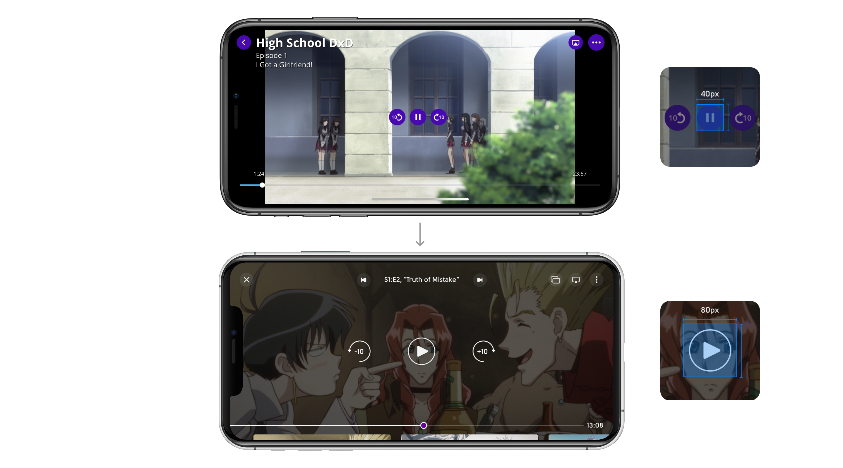
The white background seems excess. Why not use a dark transparent layer while interacting with the video?
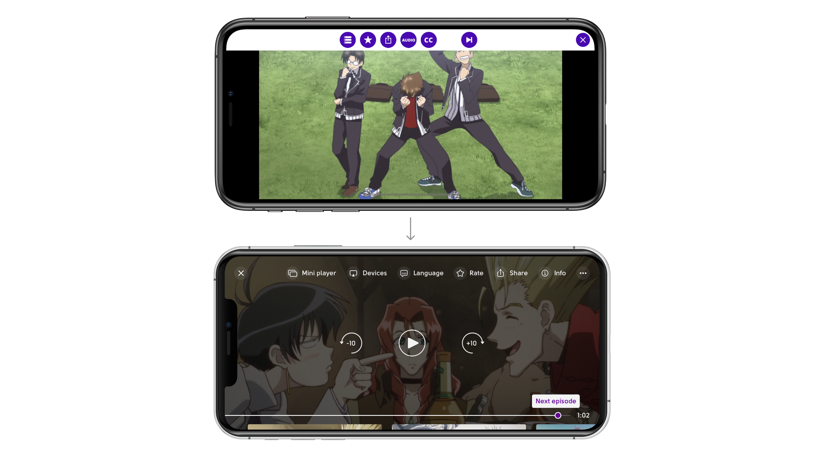
It’s not so important to read about anime I’m watching right now. A much more important thing is convenient navigation between episodes.
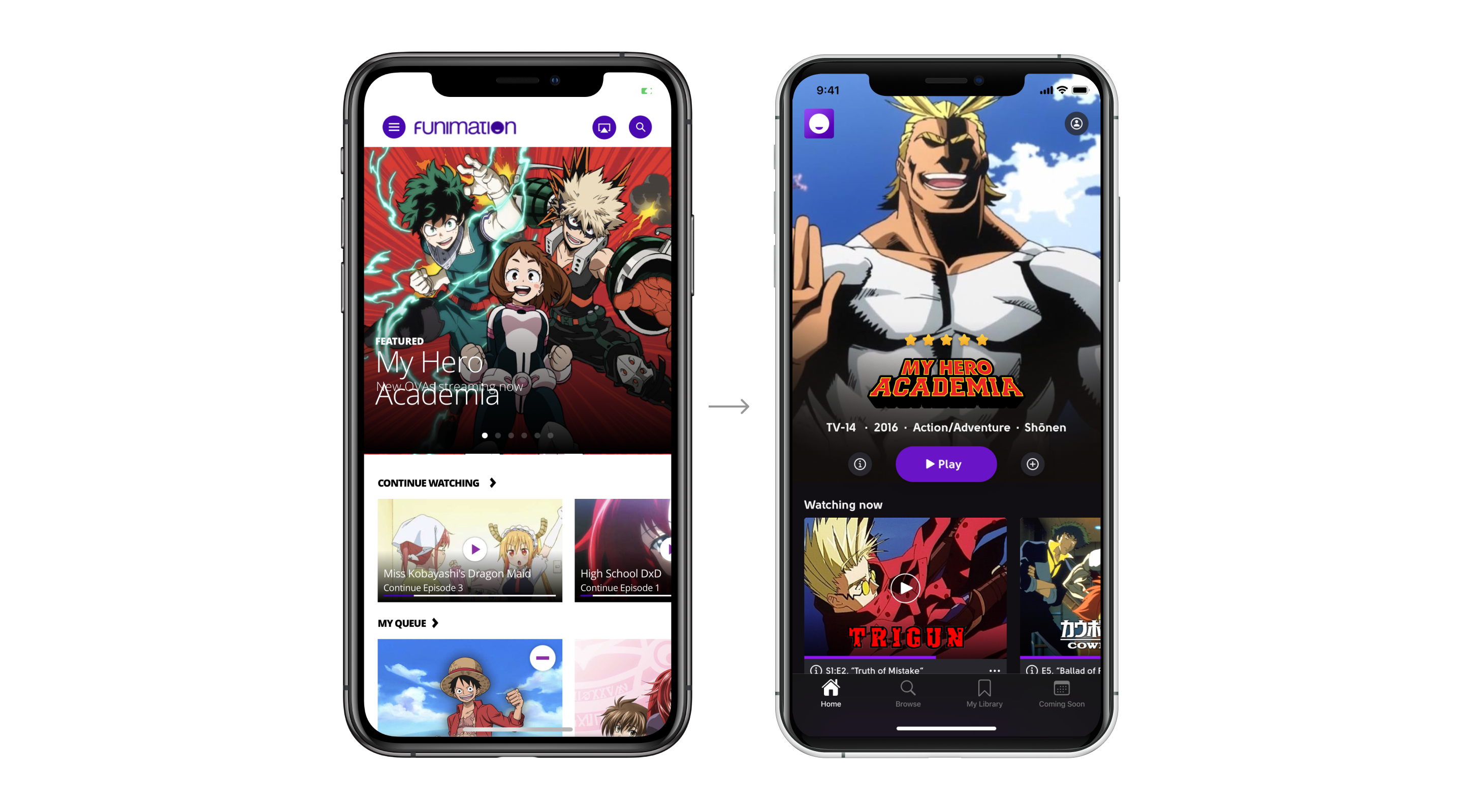
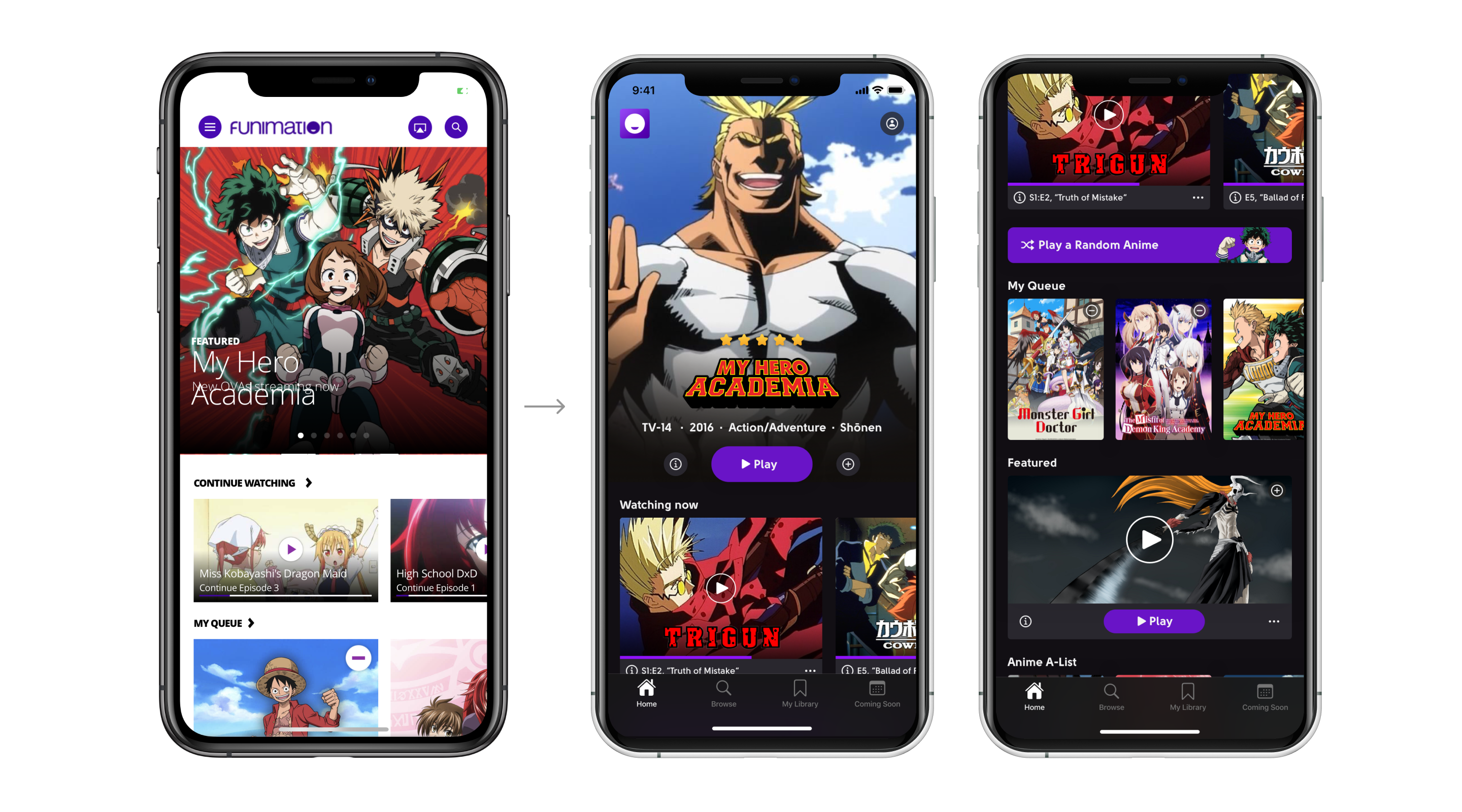
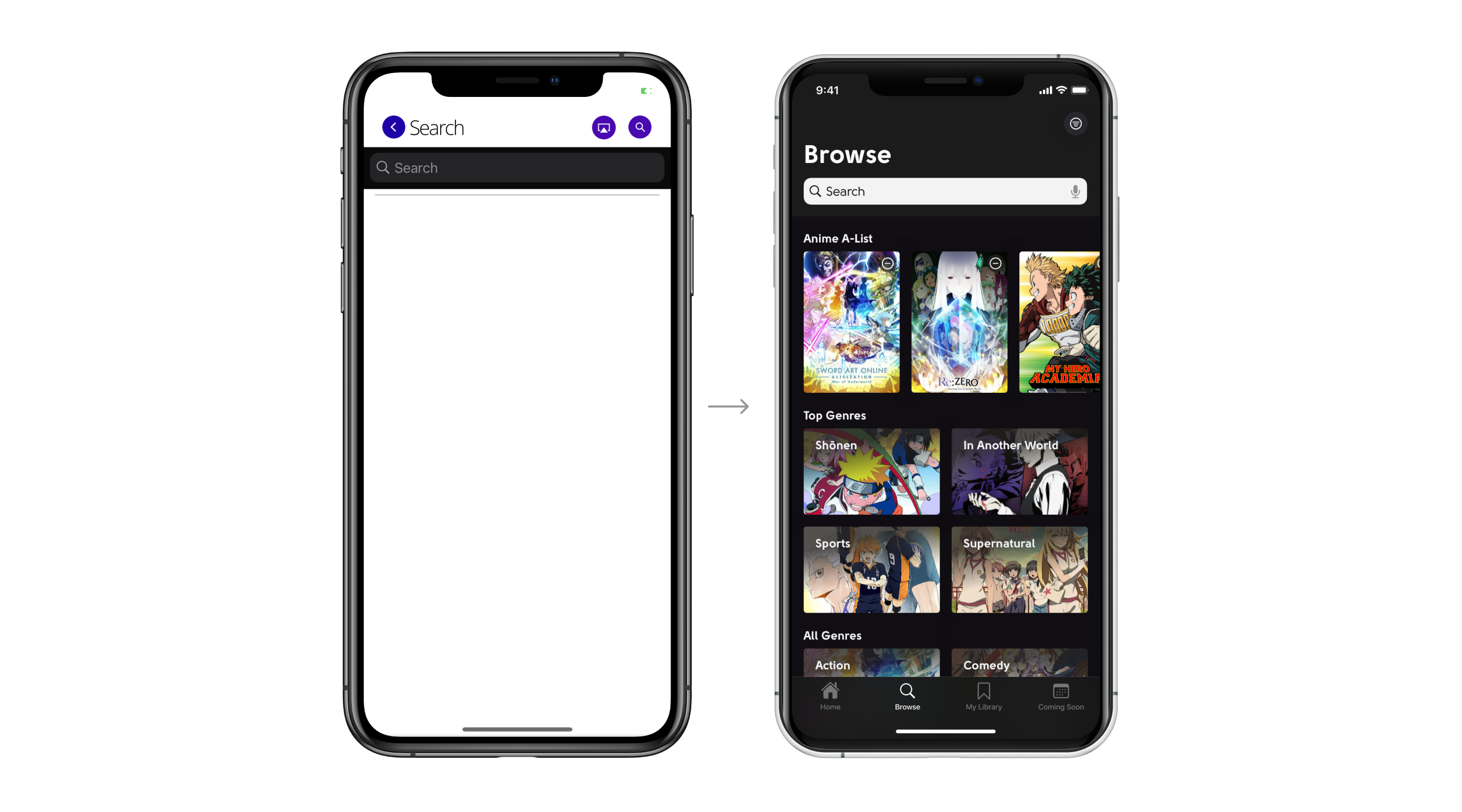
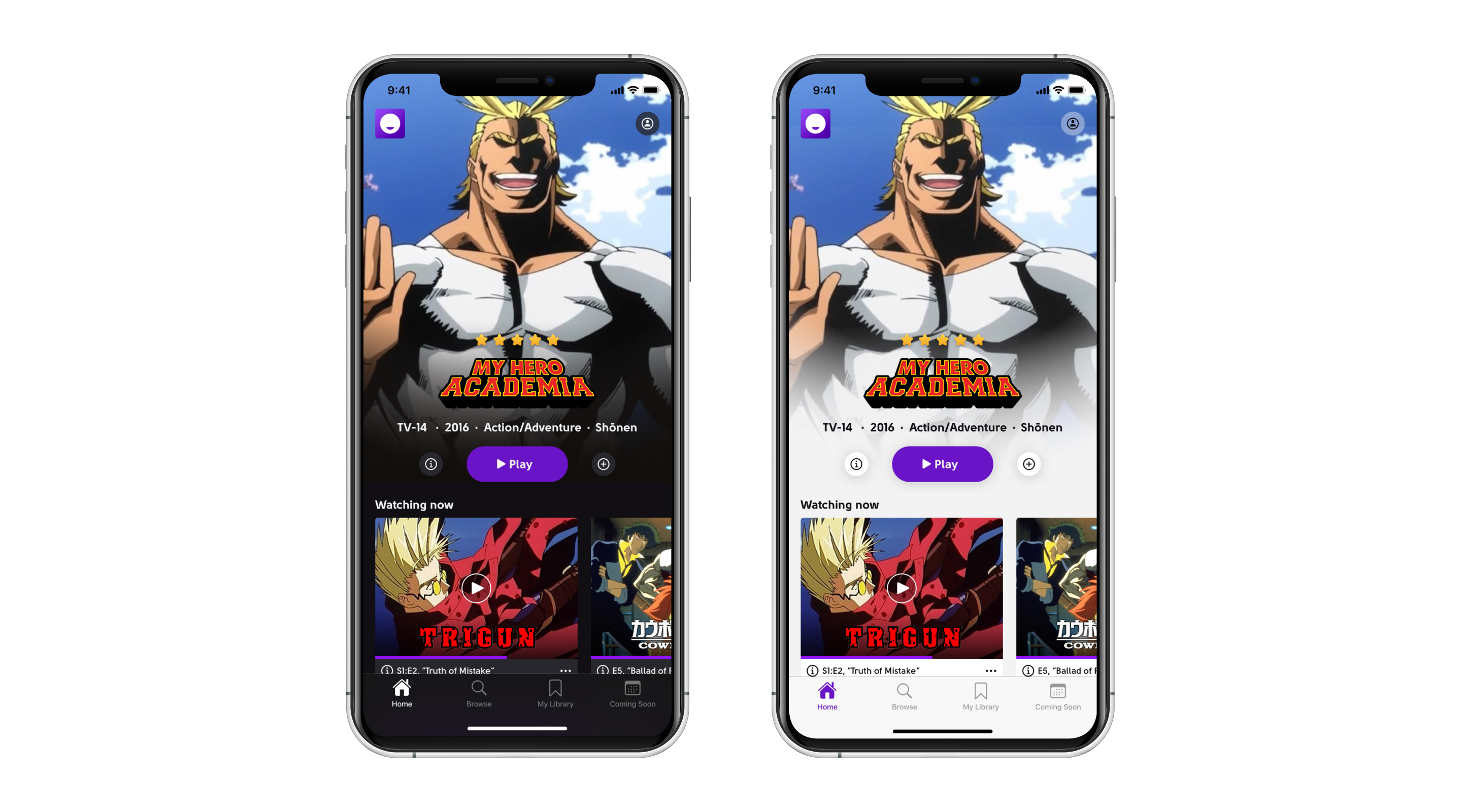
Home Screen & Navigation
The bottom tab bar is a good practice. It allows users to switch fast between the most important app sections.
- So I suggest replacing the burger menu with the bottom tab bar.
- Adding an action button like “Play” for featured anime is a good idea.
- Play a random anime button could help me to find some unobvious anime series.
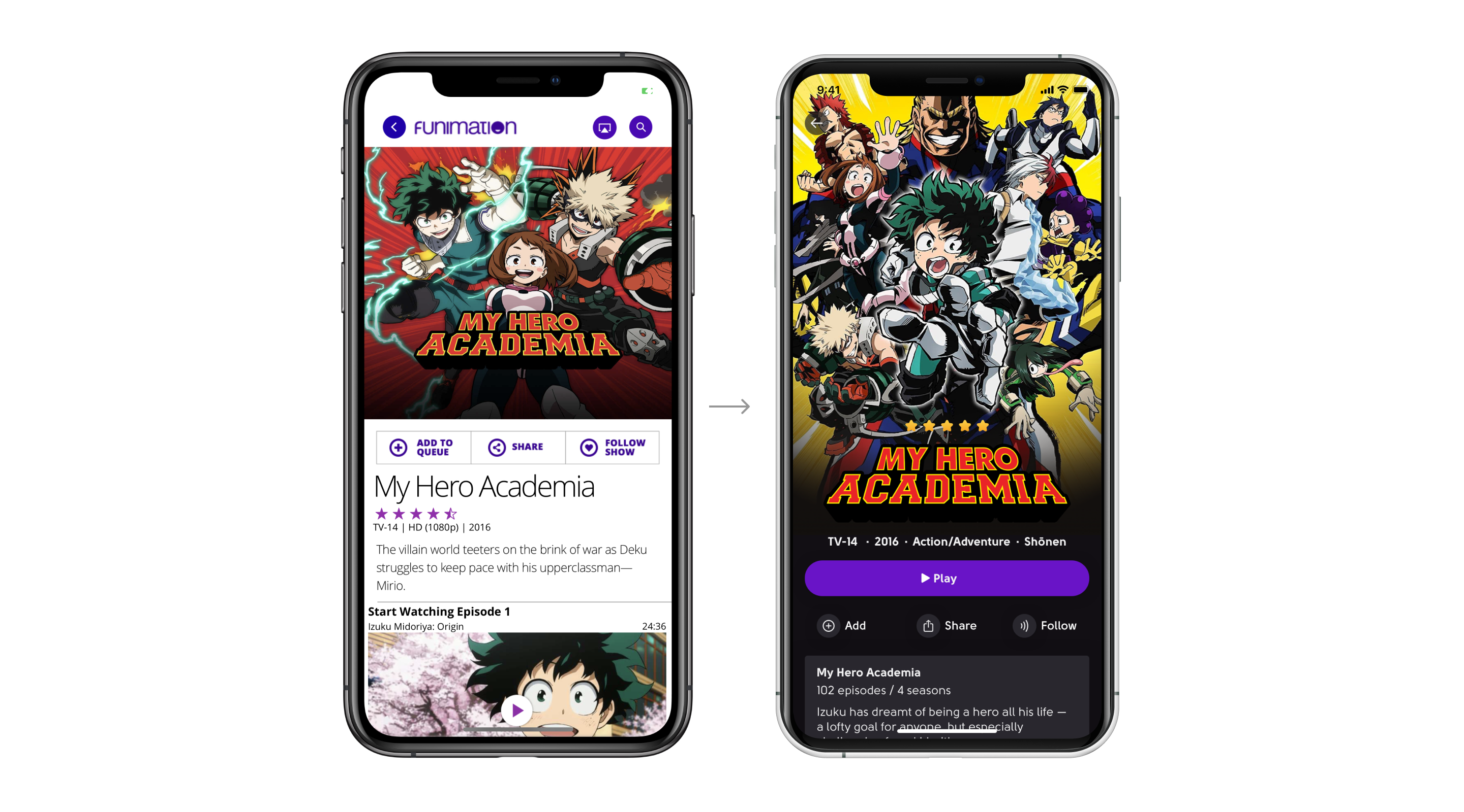
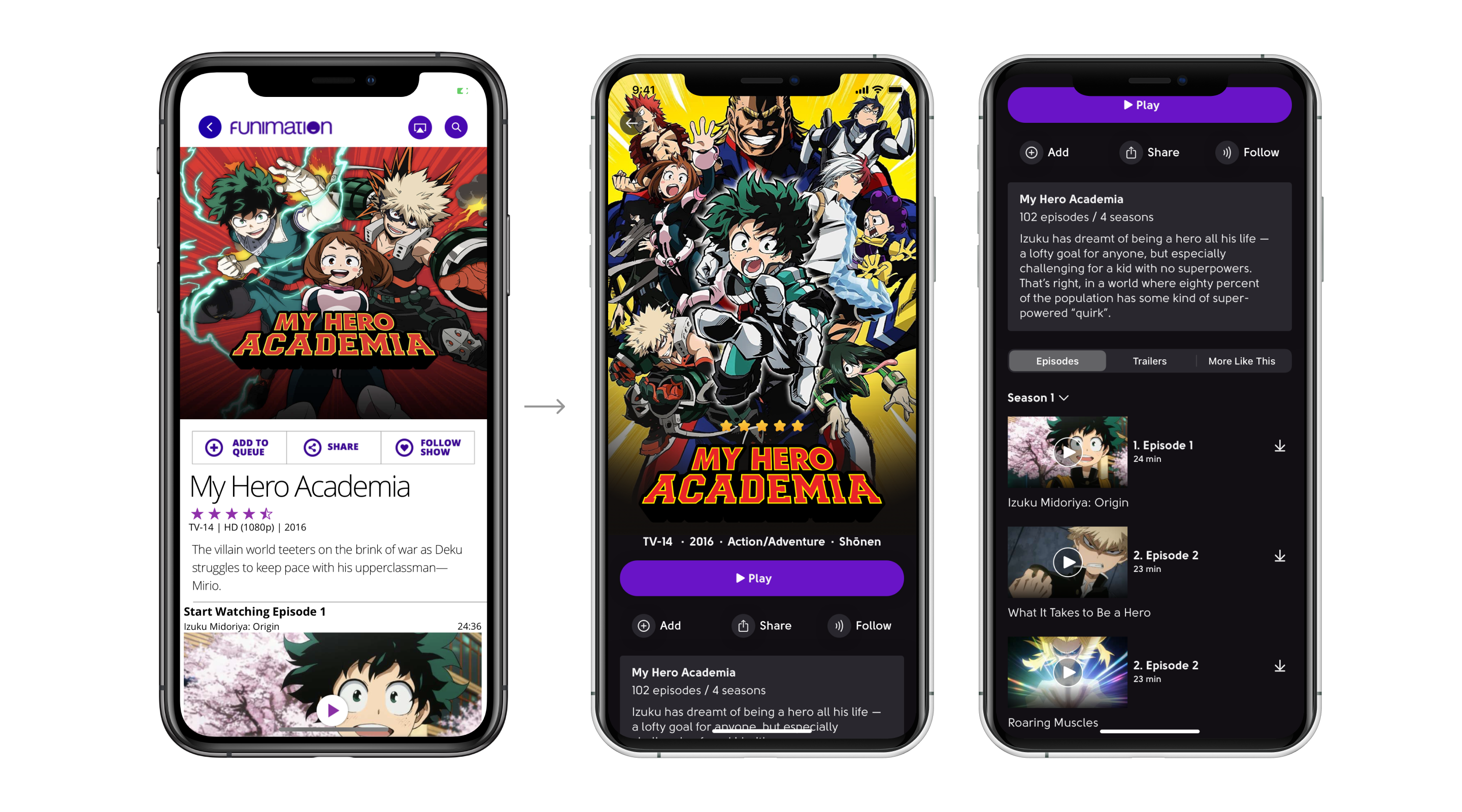
A Short Way to Play
Playing chosen anime is the most important action on the anime screen. So I highlighted the Play button and reordered some other elements.
Also, I added a total number of episodes and seasons in the show description. This small feature could help me a lot in the search process.
Finding a Perfect Match
Finding a show to watch sometimes takes more time then the user has to watch the show. Here is a version of one of the search flows, and visual concepts.
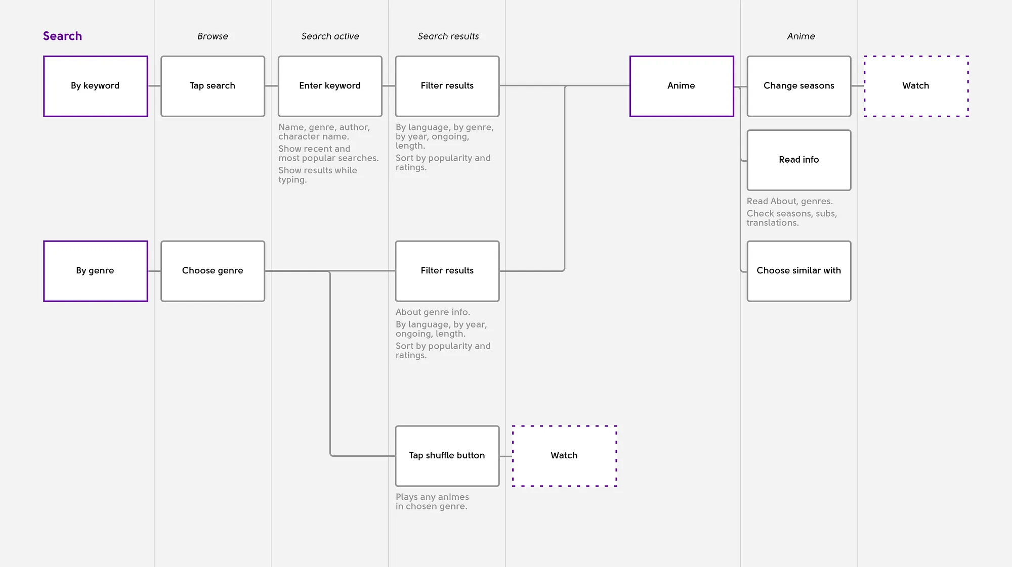
Free space on the search screen may show the top series and the top genres.
Not every user has a strong knowledge of authentic anime genres. Adding a genre description will help in member education.
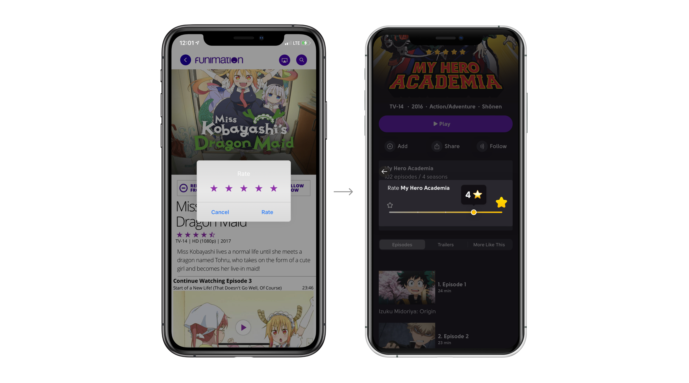
Few More Decorations
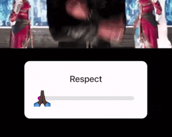
I also have some suggestions for the Rating flow. Even though it is a minor scenario, it will be fun for users to rate anime in an Instagram-like way.
Day & Night Modes
Thanks for Reading
Thank you so much for reading through this case study! It was a pleasure for me to work on this concept, and I hope that Funimation gets a chance to see this. Hope you enjoyed learning about my design and thought process, and I’d love to hear your feedback.