Customer Loyalty App
Complete redesign of a loyalty app that reduced lines in stores, solved security issues, and increased profits for a supermarket chain
How it started
Perekrestok is Russia’s leading high-quality, fresh-produce supermarket, with 800+ stores. It has one of the strongest loyalty programs. In 2016, it had no online presence except for an iOS app with a few users.
I was invited to head the design process and launch the new product. Here, I want to share not the whole story behind the project, but just the most important and interesting solutions that changed the game.
Problem statement
Perekrestok had many issues with its loyalty program. After going through the existing version and understanding the reward mechanics, I highlighted three issues that I thought could be enhanced by a better design:
- Often, customers could not find their membership card in the app, leading to long lines at the counters.
- A hard-to-use and unsecured authorization process caused security issues, resulting in data being stolen.
- The loyalty program gave customers lots of perks, but the app navigation wasn’t flexible enough to show all of them, so many users were unaware of some of the benefits and therefore, did not use them.
Design process
Whenever possible, I try to use validated knowledge and I support my ideas through research and user testing. Thus, all the features were built through the same process. Each feature was defined by user research and a deep understanding of user needs.
- Research. We used both quantitative research (mostly data analysis) and qualitative research (user interviews and field studies) to find the right problems to solve.
- Brainstorming. We had many design thinking sessions, both with Perekrestok’s team and with customers, to find the best ideas.
- Prototyping. Some user flows were designed with pen and paper, but more often in Sketch or Miro. Our team developed a UI Kit, which I used to design high-fidelity mockups, skipping the lo-fi stage.
- Tests. I chose Invision for user testing. Regular meetings and 3–5 interviews were enough to collect feedback and to define the final scope.
- Final design. For some aspects, we had to redesign the whole concept; in others, we just made a few changes after testing.
One more ingredient in this secret recipe was a close collaboration with the developers. They were actively involved in the process, validating design solutions and coming up with new ideas. Thus, when we had an idea, we knew that we could deliver it.
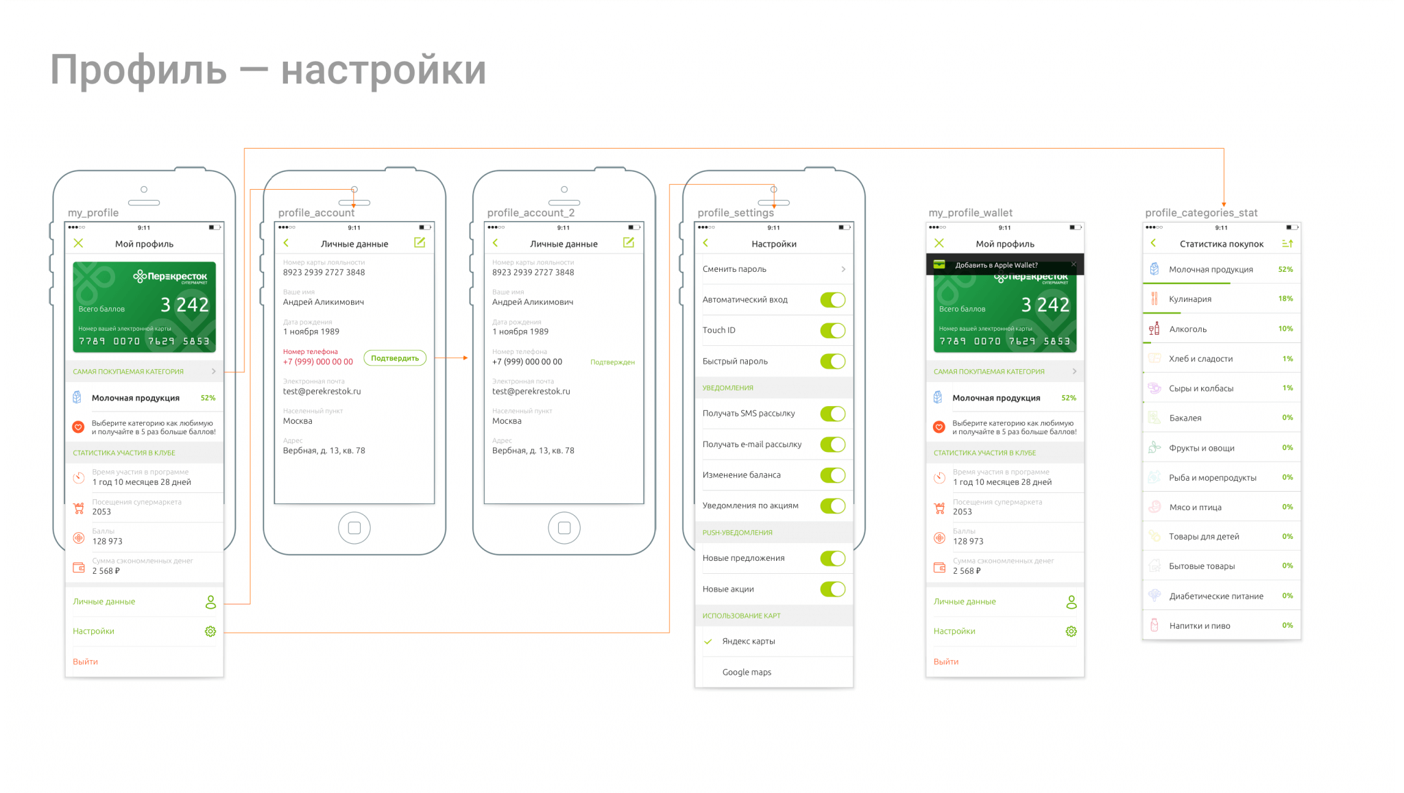
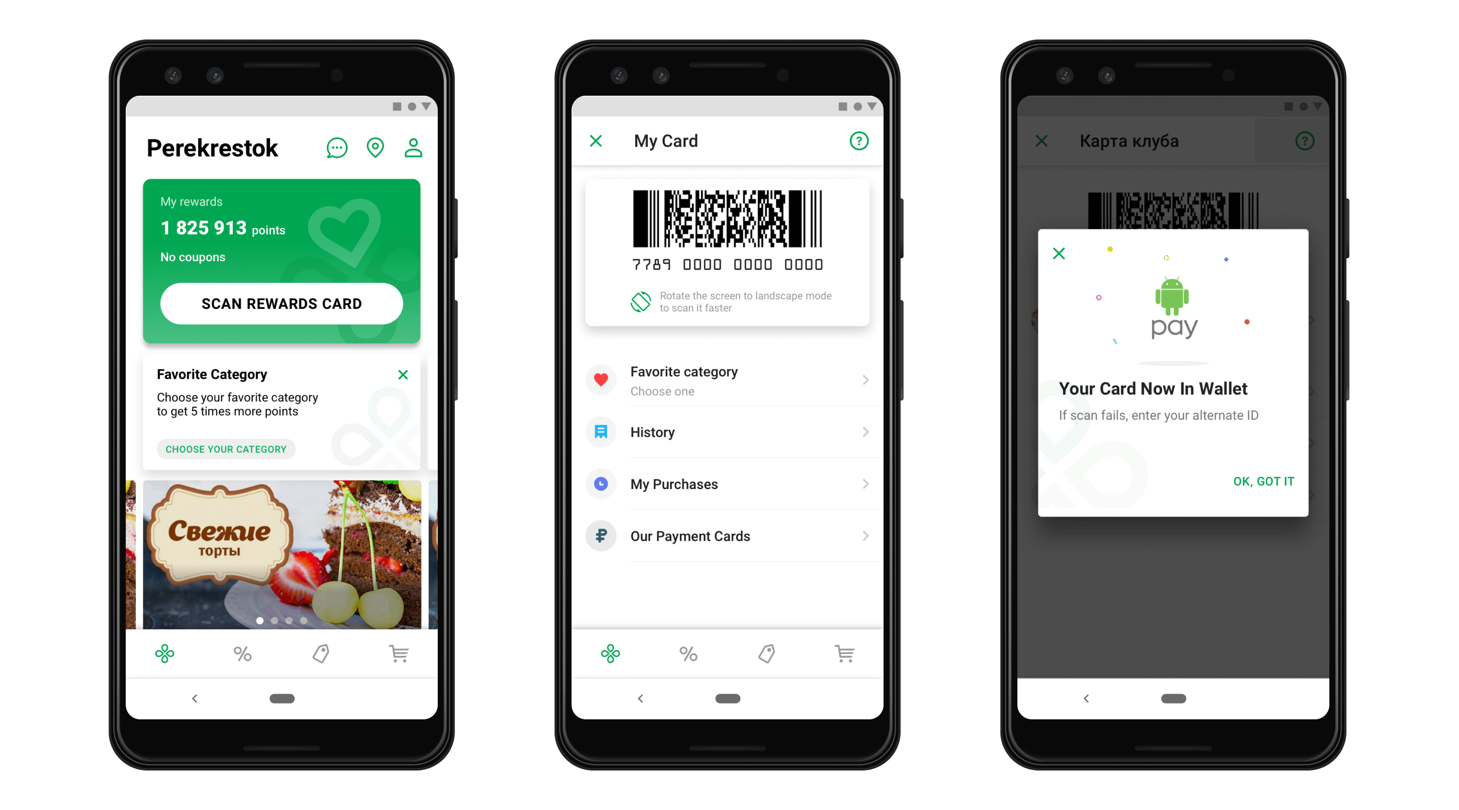
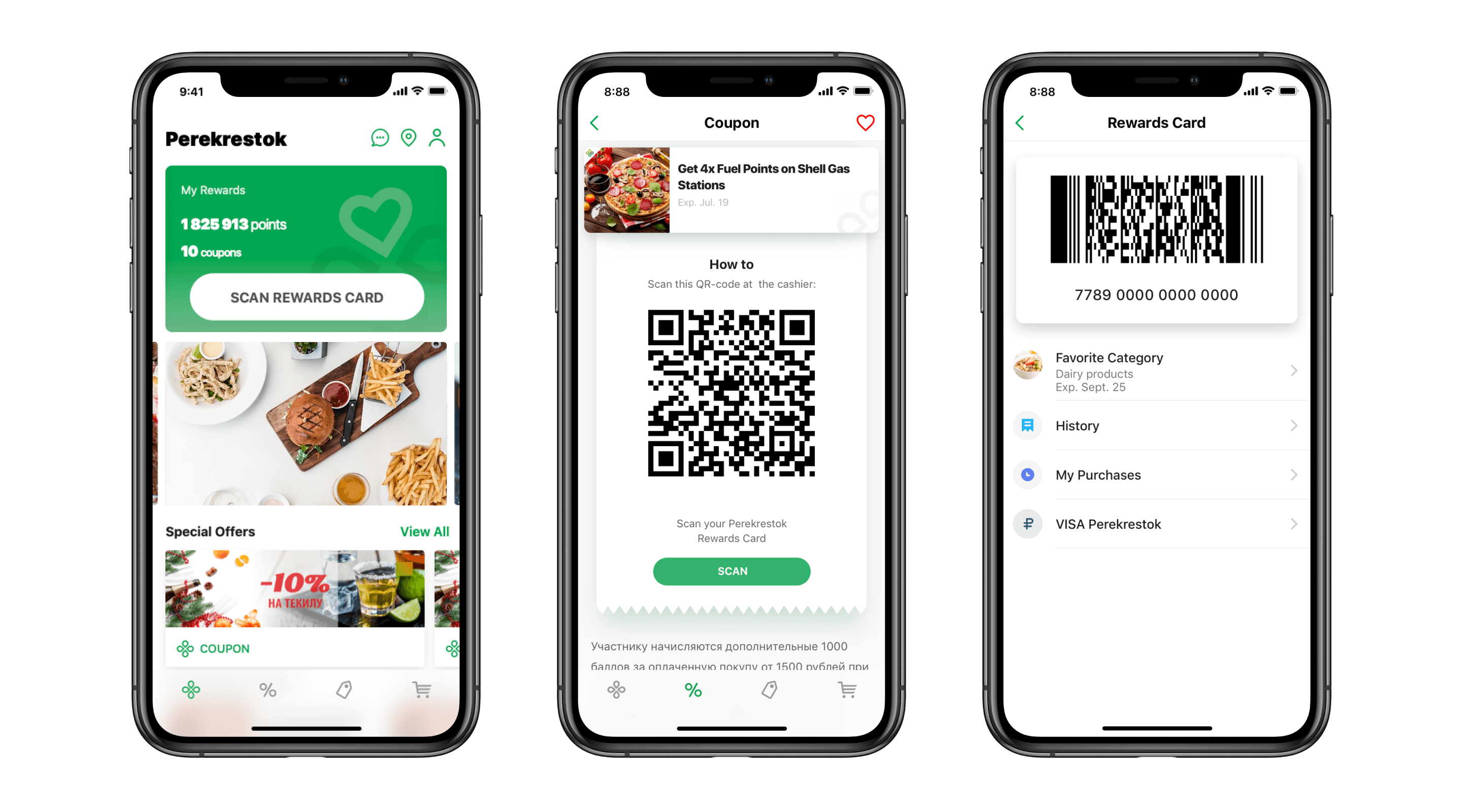
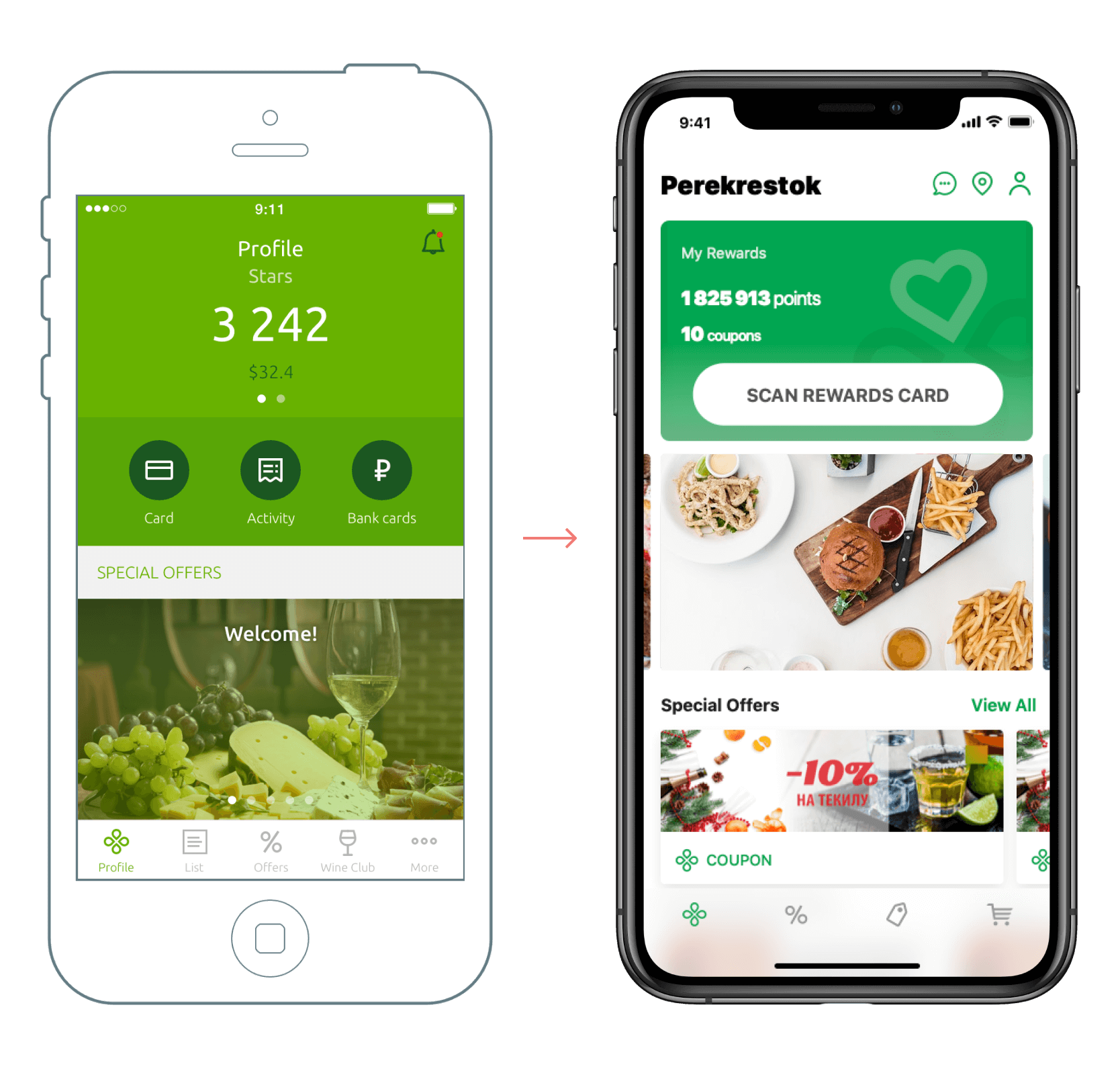
Issue 1. Membership Card
Customers couldn’t always locate their rewards card in the app.
To address this problem, I designed a nice bold CTA button on the top of the screen.
This simple solution helped to cut by a third the time spent showing a card at the counter, so it was win–win! This helped not only the customer but also the business. As a result, queues became much shorter. This was appreciated, particularly on Christmas Eve.
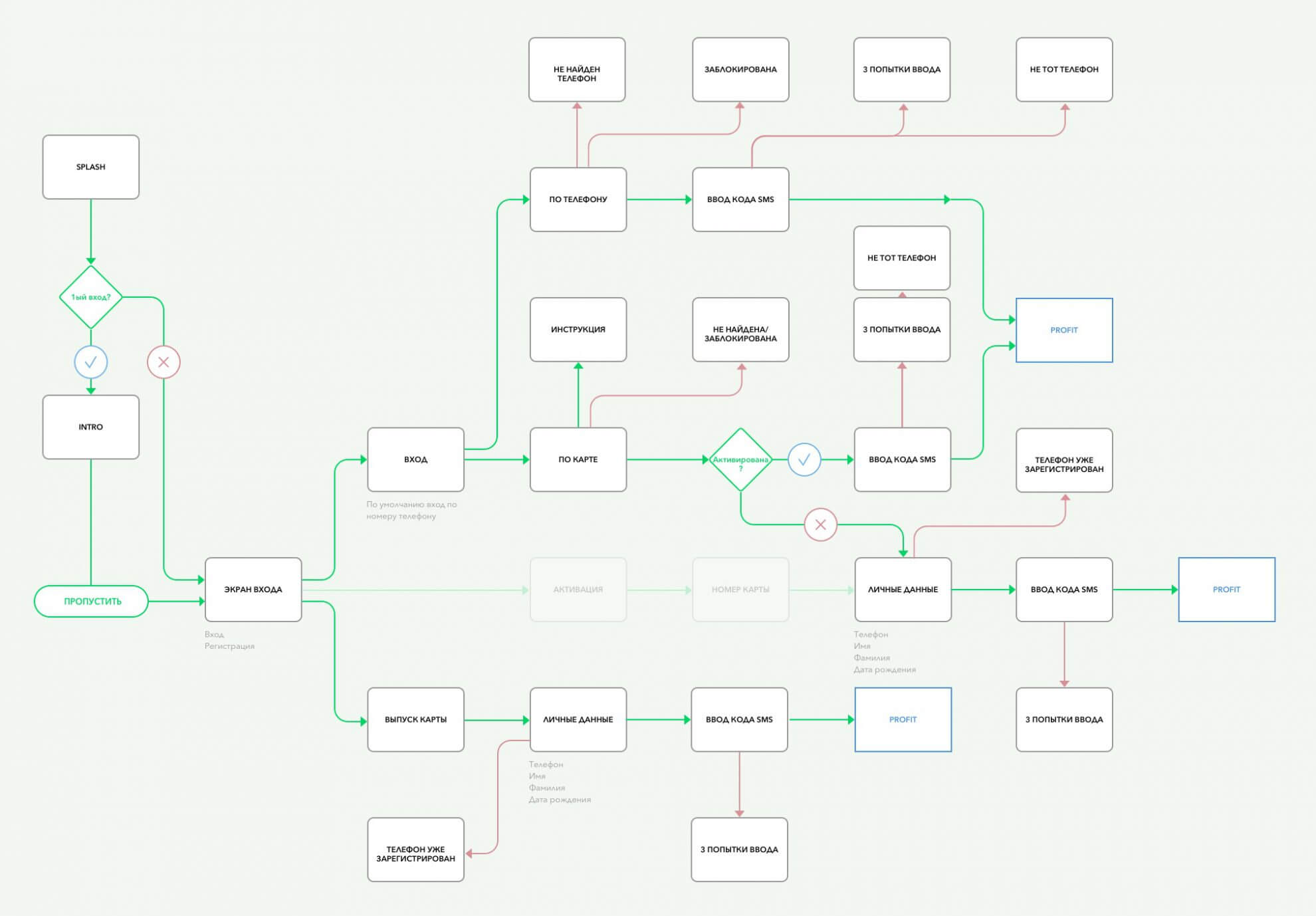
Issue 2. Security
We had a problem with hackers, who had found a weakness in the app’s security.
A security team conducted an investigation and found a vulnerability hidden in the app’s authentication process. The intruders were trying default passwords, which many users never changed.
I redesigned the whole authorization process with the help of only one developer.
The main idea was to use authorization by phone with one-time SMS codes, instead of regular passwords. With the orchestration of our fantastic project manager and with the active involvement of many different stakeholders, the team delivered this new feature.
The new authentication process made it almost impossible for hackers to crack the system.
This solution worked well for both the users and the company. Customers no longer needed to remember a password, and the company saved millions of US dollars and thwarted the hackers.
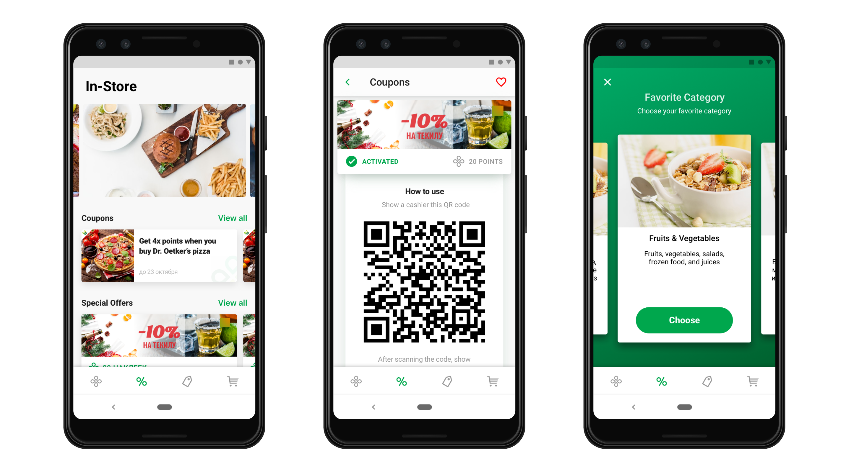
Issue 3. Navigation
A research team came up with two unobvious facts. First, customers didn’t use some important but secondary features. Second, many users never checked the offers section.
Customers were given a huge number of different kinds of offers, like secret sales, coupons, and discounts. For sure, this was one of the most important features, both for the customers and for the company.
After a brainstorming session and my own research into competitors, I suggested some dramatic changes, i.e. eliminating the two unpopular sections and redesigning the whole informational architecture of the app.
That needed some approval, so we were held up for a while. Some stakeholders were in love with these features, whereas others were just not ready for such dramatic changes. Fortunately, we had a lot of data and the best team ever. After a few months of user tests, improvements, and meetings, we delivered the redesigned version.
And this hard work was paid off!
The number of visible perks increased, which resulted in increased sales.
The app size was reduced from 250 MB to 150 MB. This meant more users could install the app, so we increased the number of installs.
The flexible informational architecture of the new app allowed us to provide more personalized and accessible experiences.
Results
With these and many other improvements (e.g. mobile ecommerce, support for Google Wallet and Apple Wallet, in-app games, etc.), the app became a game changer for the whole industry. It boosted sales and totally transformed the customer experience.
🔥 During two years, we achieved 1.5M monthly active users and more then 14M of installs (10% of the population) with a 4.5+ average rating in the App Store.