Good Time, the Sleep Calculator
An iOS app that helps people to wake up feeling fresh and energetic each morning.
How it started
I read a wonderful book Sleep Smarter by Shawn Stevenson, which inspired me to jumpstart some healthy changes in my life.
I started by building better sleep habits, but I couldn’t find an appropriate app for my personal needs.
Problem statement
I found many apps that are useful for waking you up or helping you get to sleep, but none that helped to build a habit of getting good sleep every day, at least for free.
Most people would sleep better if they understood sleep cycles and simple sleeping rules.
Here are some of the main ones:
- An average sleep cycle lasts 85 to 110 minutes.
- You need five complete cycles to feel refreshed in the morning.
- Don’t use any electronic equipment in the 1.5 hours before going to bed.
These principles are pretty simple, aren’t they? But how can we help people to apply them to their lifestyle?
Brain dump
Because of a lack of coding skills (I had just completed the Swift for Beginners course on Udemy), the app would have just one or two simple features. Better done at all than done perfect, right?
After a brain dump session, I came up with some ideas:
- Sleep cycle calculator: Work out when to go to bed to wake up feeling refreshed.
- Notifications with some useful sleeping tips.
- A schedule builder: Build your schedule based on when you want to wake up.
Research
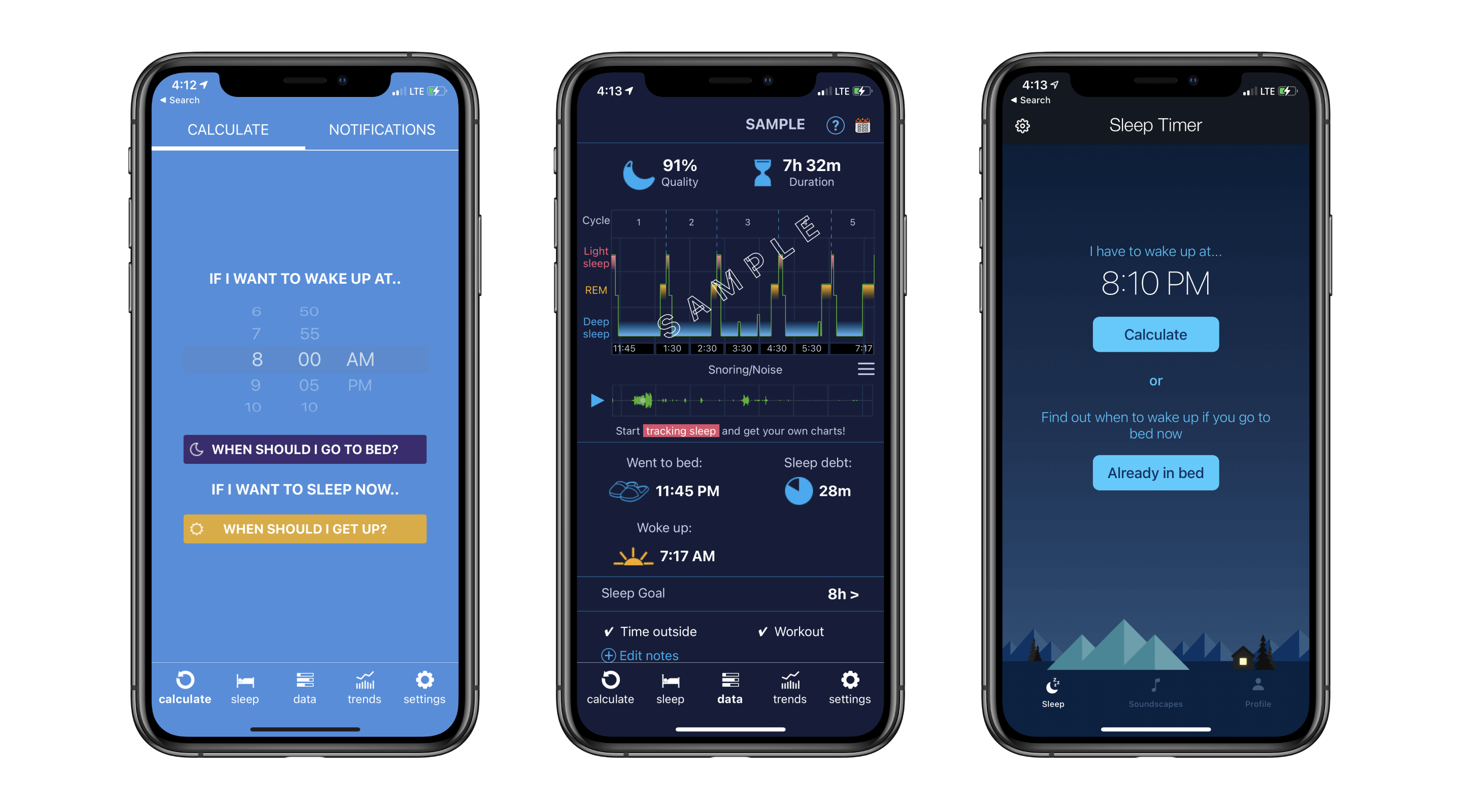
After finding some competitors, I used each of them for a week. Although Sleep Calculator Pro has a lot of functions, its UI is complicated. Sleep Timer has a cleaner UI, but I felt the user experience could be much smoother. I then asked some of my friends to test the same apps and share their experiences with me.
This research with my friends and family helped me to understand a user’s needs much better. Here are the most important findings:
1 Add Value With Minimal Interactions
“I worked late into the night. Then, going to sleep, I tried to calculate the best time in the morning to wake up feeling fresh”
Most interviewees didn’t use it to plan their bedtime. Rather, they used it to calculate when they should wake up. This was the most popular use case of the app.
It meant that they were really tired before going to bed.
Conclusion: When someone looks at the app and is about to go to bed, it simply needs to show them the time when they should wake up, without any additional interactions.
2 Remember the User’s Preferences
“Fortunately, now I know when to finish my day to get a bright morning”
A bedtime calculator is a very important feature. On the other hand, for many users, they use it just once. When they’ve worked out when to go to bed before a working day, they don’t need to calculate it again.
Conclusion: The second screen should always show the preferred bedtime. The app shouldn’t need to ask the user for any additional information if it already knows their preferences.
3 Educate the User
“Ok, now I know when to go to sleep. But it takes too long for me to fall asleep”
Almost everybody has a problem with sleeping. Stress, disrupted schedules, poor diet—these are all just aspects of our modern lifestyles
Conclusion: The third screen should add some value. For example, it could be a daily calendar for better sleep or give some sleep advice.
4 Dark Theme Required
One other insight was pretty obvious, but still very useful as confirmation. If Sleep Calculator Pro is opened in the middle of the night, it is so bright it wakes you even more.
Conclusion: It is vital for a sleeping app to have a dark theme as well as a bright one.
UI
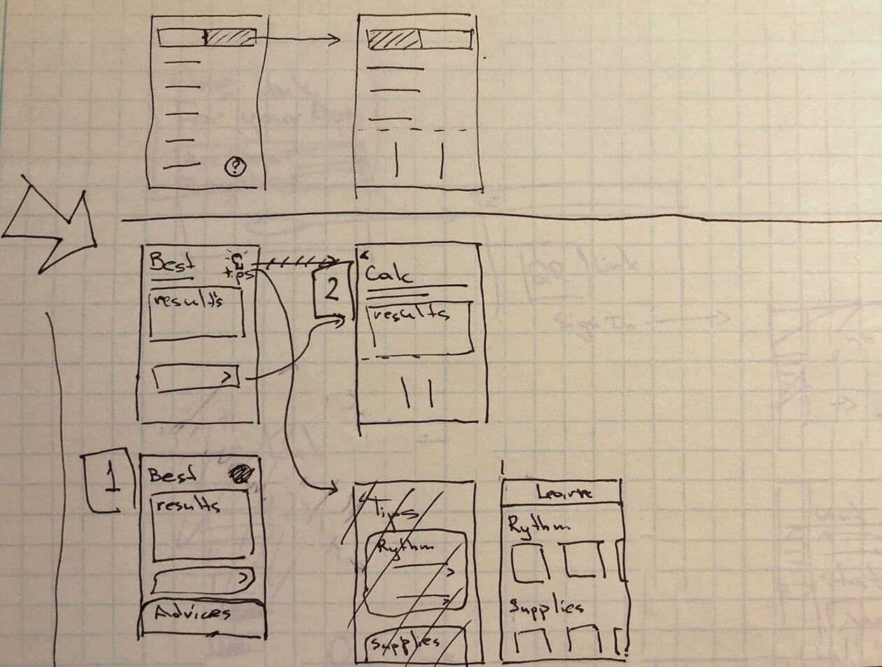
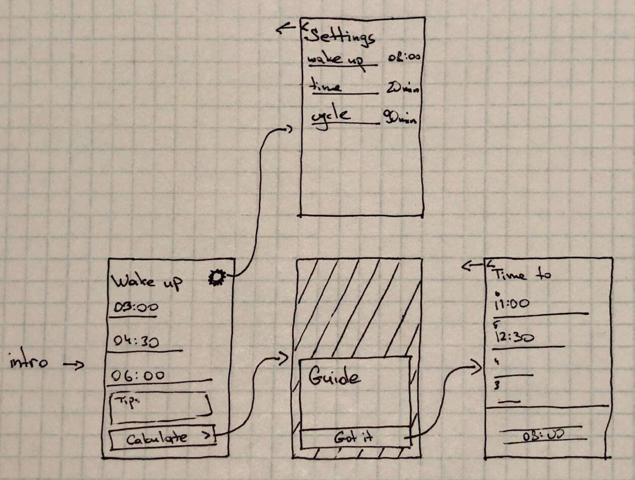
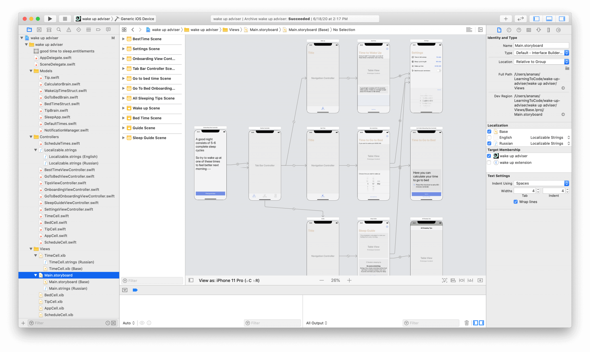
After finalizing a few initial sketches, I opened Xcode and started with some basic iOS elements.
I iterated on every working version and used feedback to validate my assumptions about the requirements.
Thus I found a bunch of improvements:
- It was a challenge deciding which order to show the times. First, I sorted them by the number of sleep cycles, but the users didn’t understand the difference between the first and the second sections. So I sorted them by time.
- As it can be seen in the initial sketches, I didn’t plan to use a tab bar for navigation, but a user test showed that this was the best option.
- Many users didn’t understand the logic behind the calculations, so I added some small tips with basic explanations.
Navigation
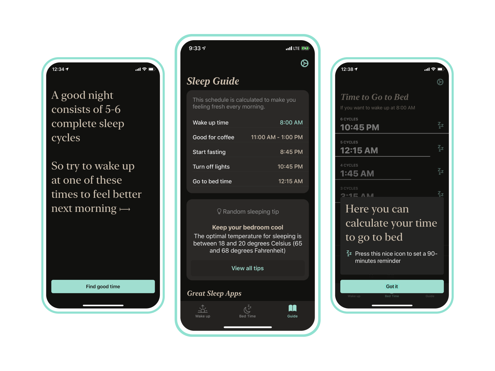
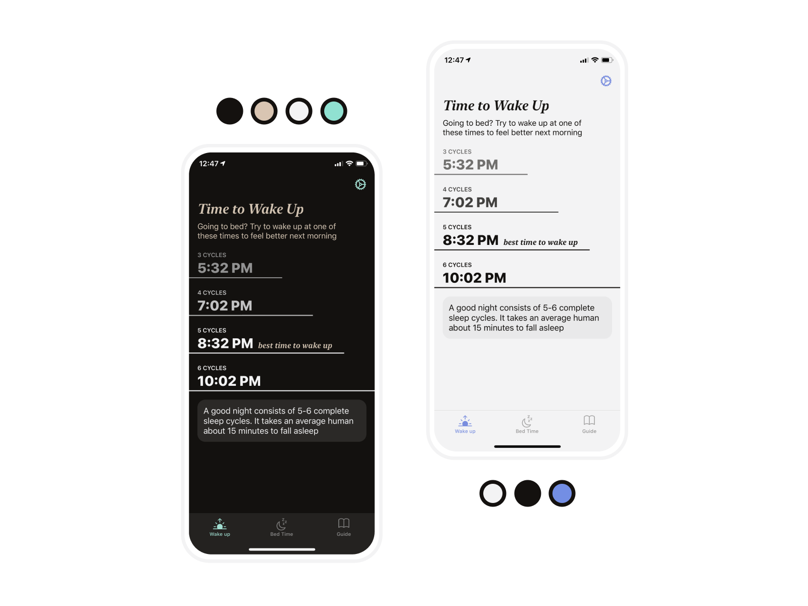
The app has three main sections: Wake up, Bedtime, and Guide.
- The Wake up section shows when the user should wake up if they go to bed at that moment.
- The Bedtime section calculates when they should go to bed if they know when they want to wake up.
- The Guide section gives sleep advice. Users can schedule their day and do other secondary tasks.
- There is also a Settings screen, which allows users to set the length of their own sleep cycle, how long it takes them to fall asleep, and control notifications.
Visual concept
The color palette for a sleeping app has to be calm and natural. Inspired by my favorite candies, I chose black, mint, and peanut colors for the dark mode, and Oreo’s white, black, and blue for the light one.
For the fonts, I decided to use the beautiful SF Pro and New York by Apple.
5-star launch
Before the launch, I conducted one more user test, which had a really interesting result. Even those users who know English perfectly were struggling to understand the instructions. They had to use additional effort to translate even basic things. As a result, I added localized the app.
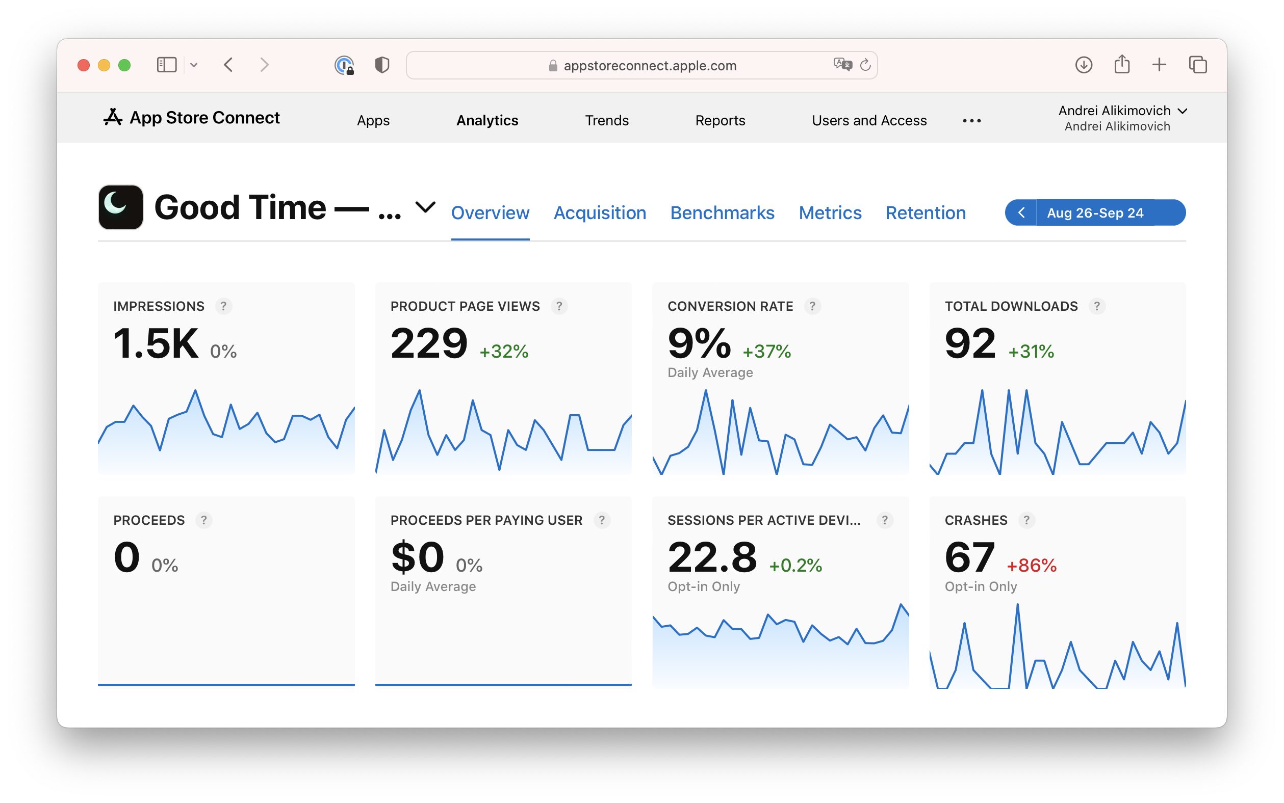
It’s three years now since the Good Time app was launched, and I’m happy to share that, even without any promotion, hundreds of users are using it to sleep better.
Download it here