Fitbox Digital Marathon
This app helped 170,000+ athletes compete online, earn discounts, and find motivation.
How it started
Sberbank, Russian’s largest bank, and VISA decided to launch a new experimental product to help their customers become fitter and healthier. After a few design thinking sessions, we came up with the idea for the Fitbox app.
My role was to develop the creative concepts and head the design process.
Goal
Every year Sberbank organizes the Green Marathon, a running competition for everyone. Our first goal was to bring this competition into the digital world.
Research process
Many Sberbank employees participate in the marathon, so I had hundreds of potential interviewees right in the same office building. I used three types of research to understand the users’ needs:
- A UX researcher and I conducted 10 in-depth interviews. In addition, our team hosted design thinking sessions with marathon runners to get ideas.
- I tested fitness trackers (Mi band, Jawbone, Apple Watch, and Healbie) and fitness apps (Runkeeper, Strava, and Nike Run Club) to explore their gamification mechanics and identify best practices.
- I went through all the existing documentation from past running events organized by Sberbank.
Research results
This research provided invaluable insights.
Runners are achieveres
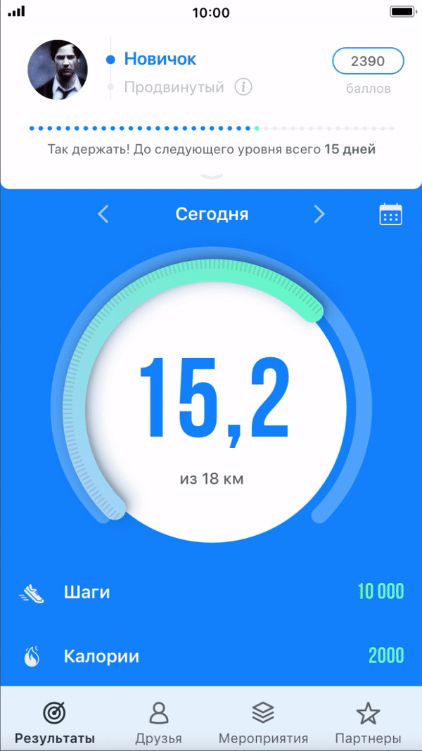
Marathon runners care about badges and levels. It is so important for them to get an award after a competition.
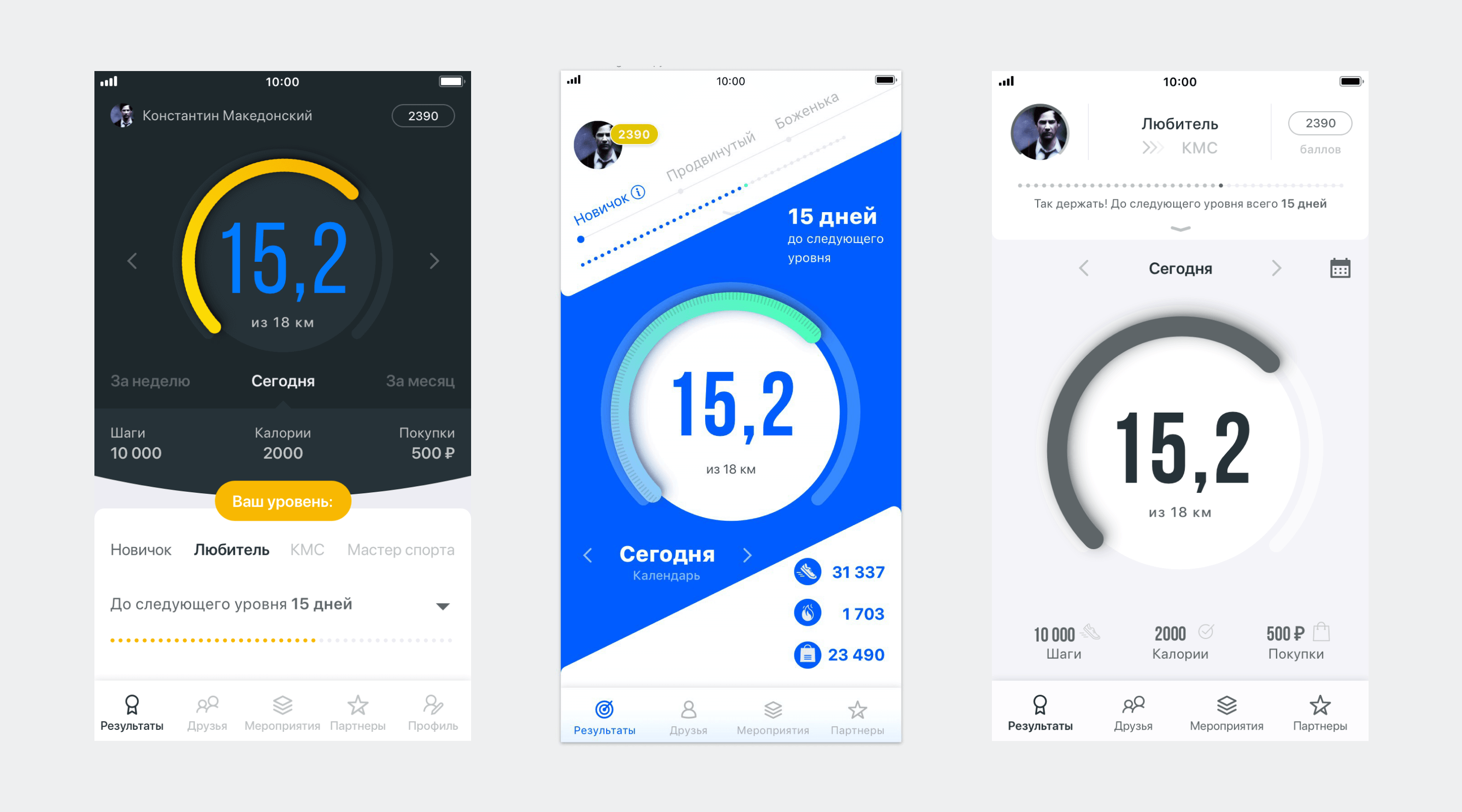
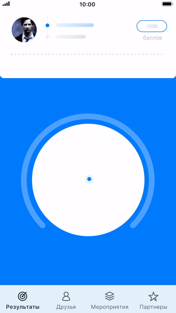
As a result, I added progress bars, achievements, and the user’s current level on the first screen to encourage their passion to compete.
Forget about maps
All the runners know the route of the Green Marathon, and no one needs a map during the run. The most important things are distance and timing, so you can see where your friends are.
Conclusion: I decided to retire the map from the app, which saved our team weeks of work.
Simple is better
The runners use different devices to count their steps, speed, and distance. In the beginning, our plan was to add integrations with the most popular of them.
Conclusion: After doing some research, we decided to integrate only with Google Fit and Apple Health, which was much easier and faster for the first release.
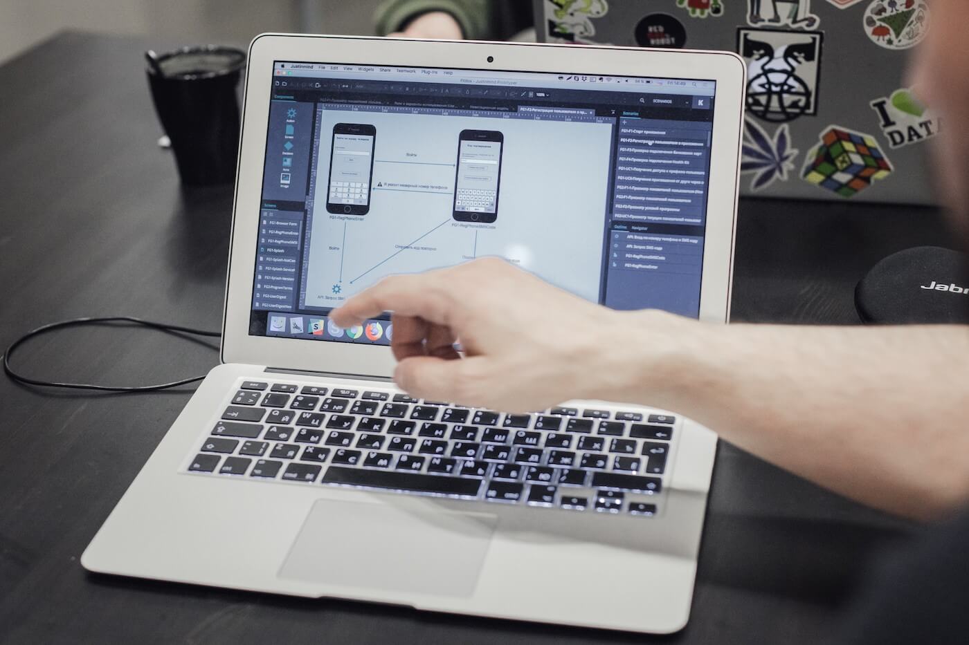
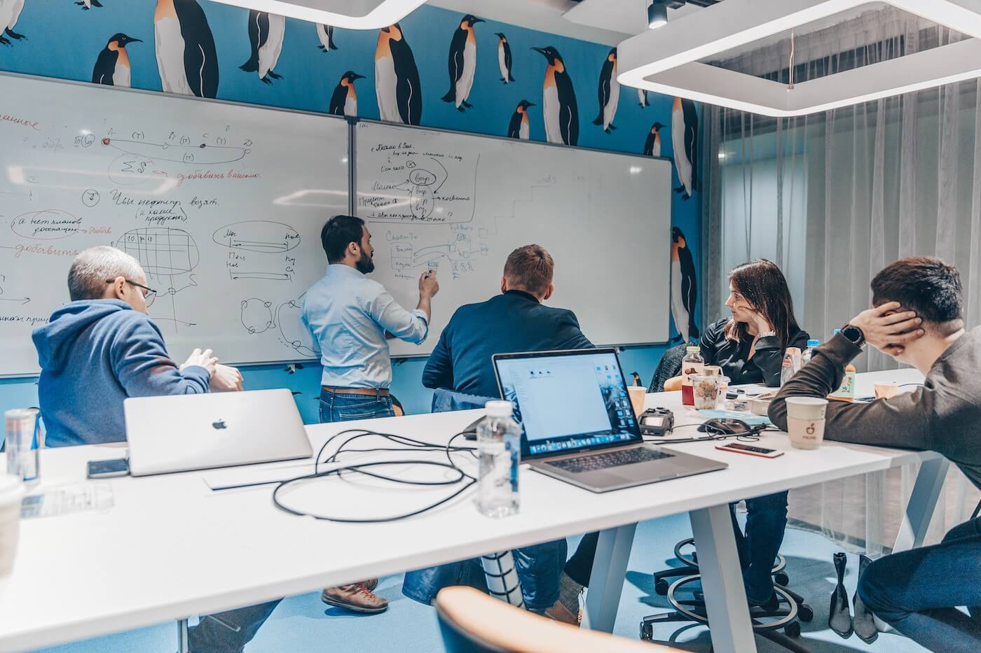
Collaborative design
Once the basic user flows were ready, the team and I started working on the interface design. I was the head designer, and there was another designer who worked on the details and states. We worked in close collaboration with a UX team and the developers, who gave us priceless feedback. Due to this collaboration, the final design was useful, beautiful, and easy to code.
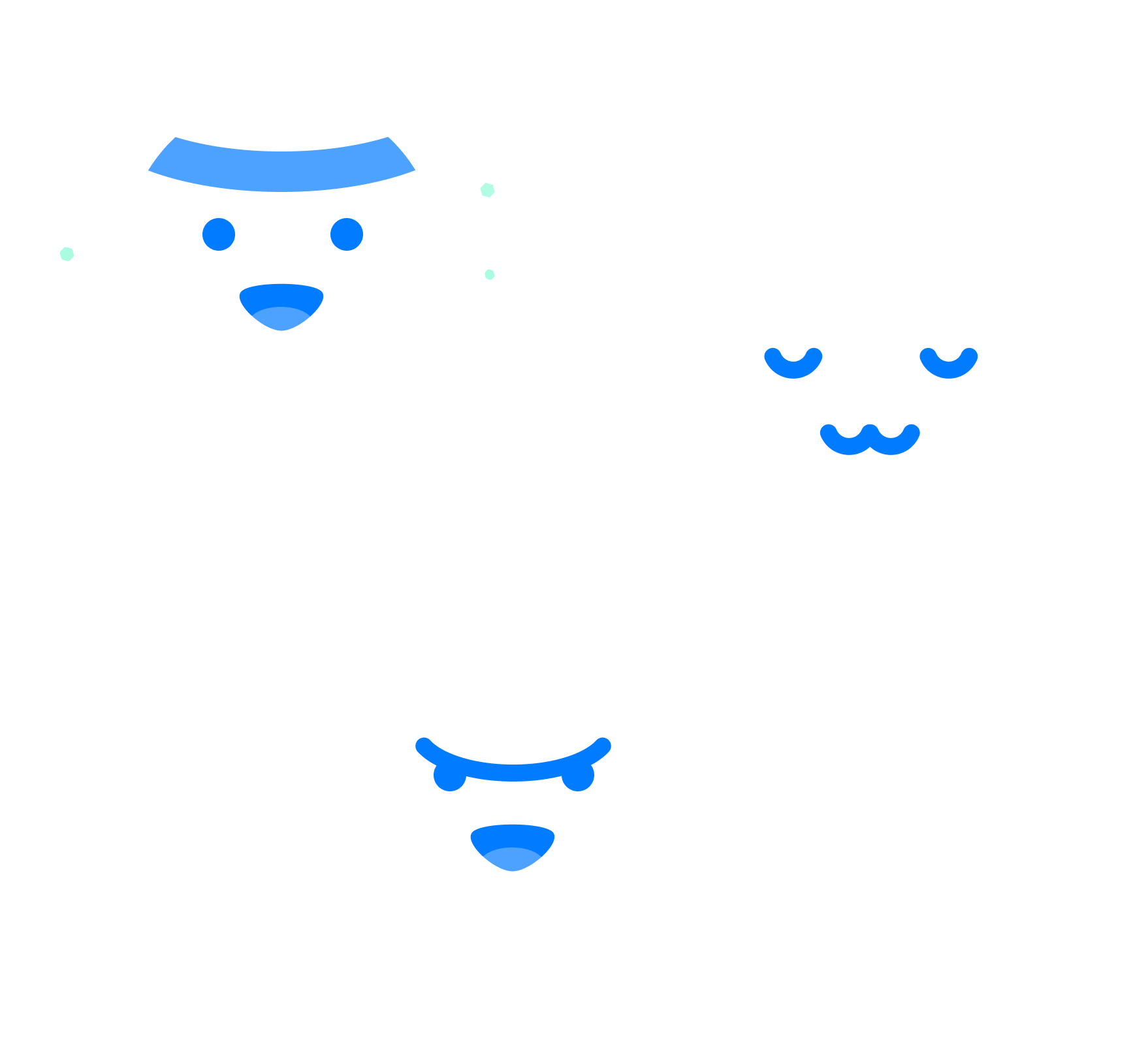
Character
I suggested that we design a character for the app, named Fitty, who popped up in different parts of the app to communicate with the user and to show important states (like no internet, loading, no information, etc.). Even for the edge cases, this fun character helped keep the user in a good mood.
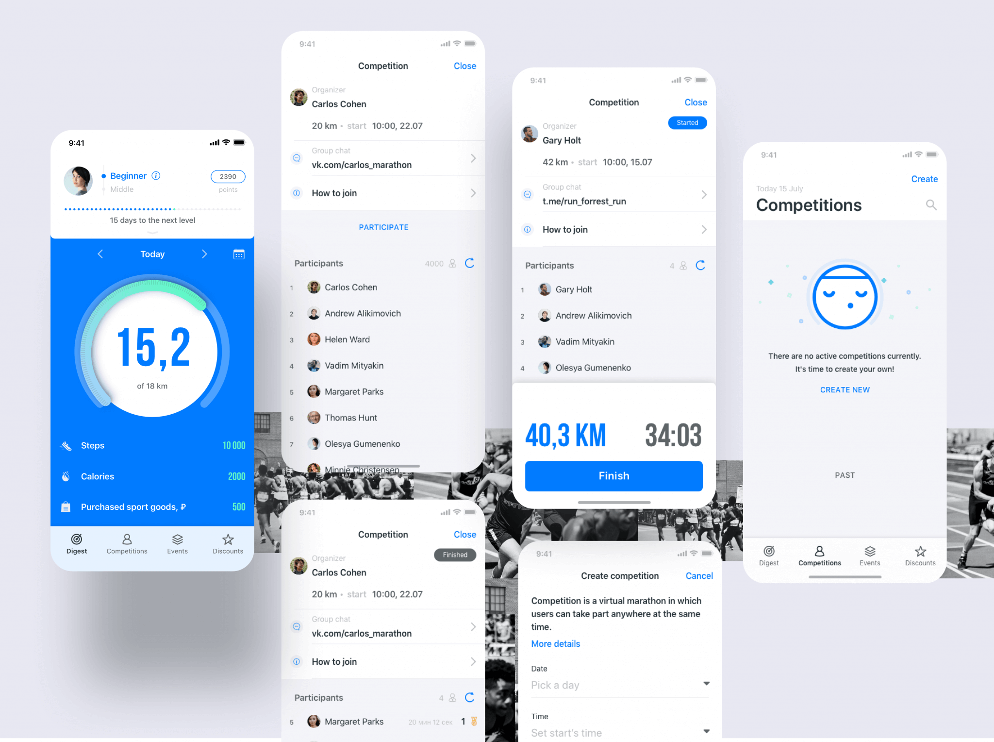
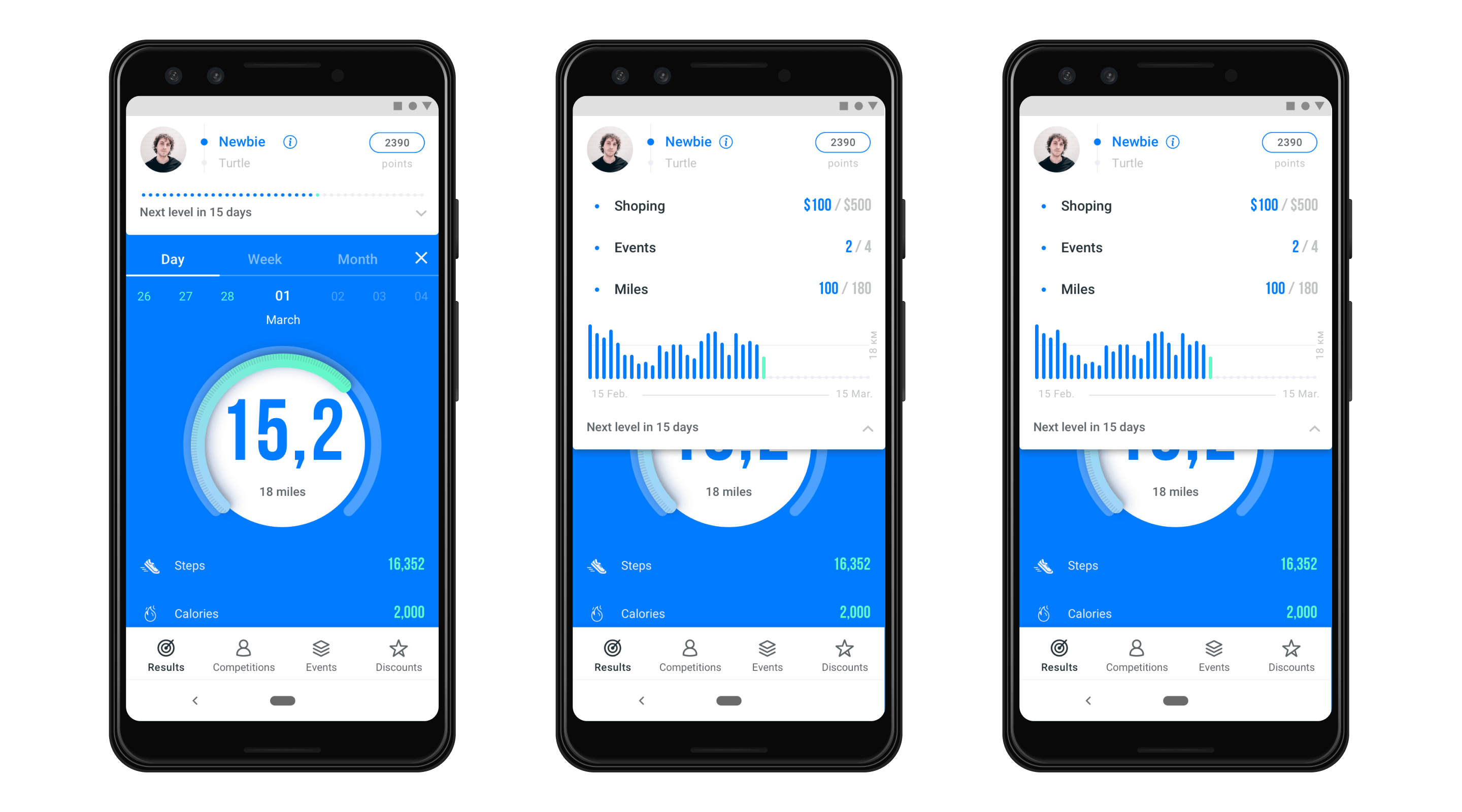
Digest
I sought to follow native patterns when designing, although I deviated from this rule in the “Digest” screen in some cases to improve the user experience.
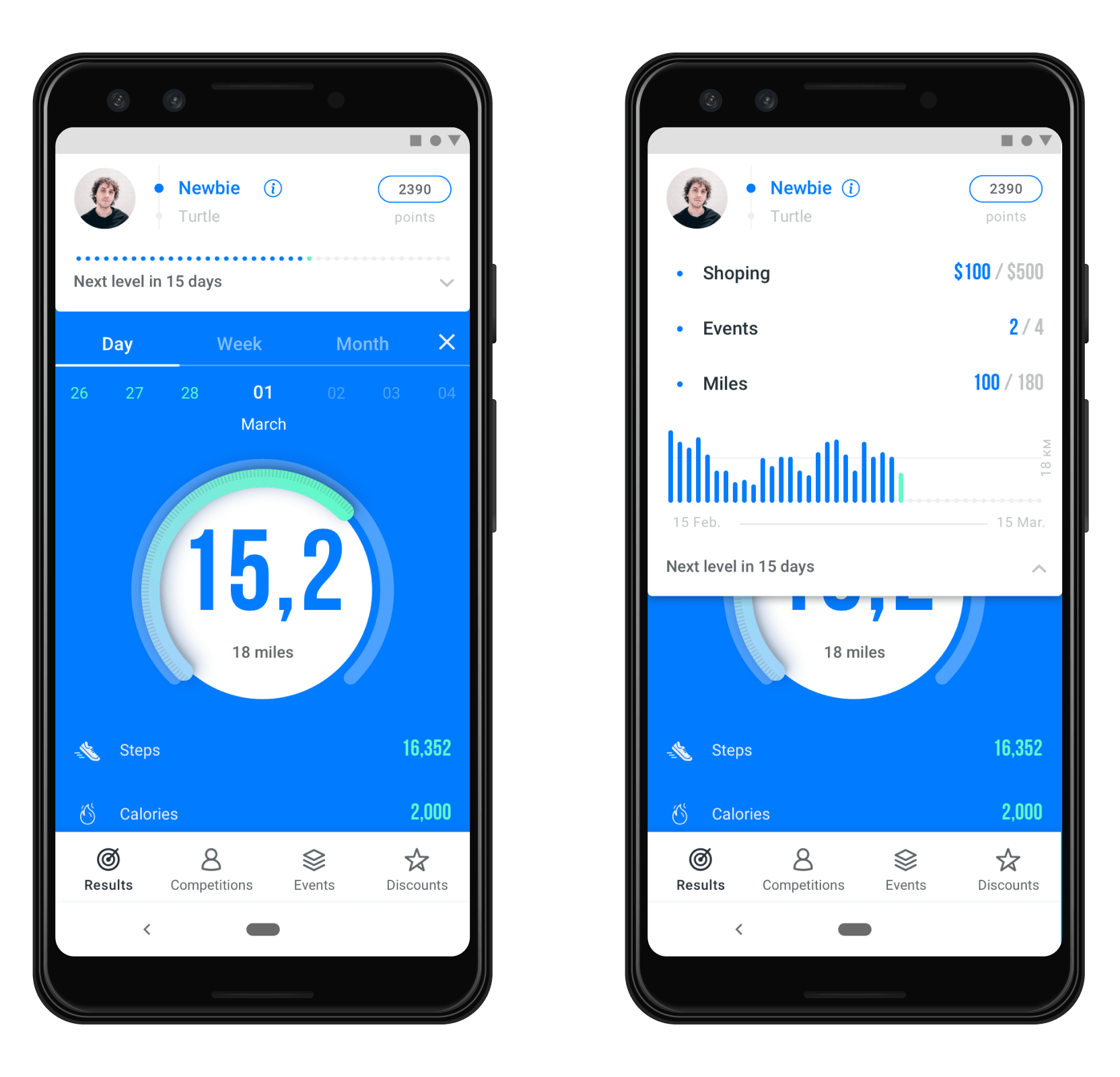
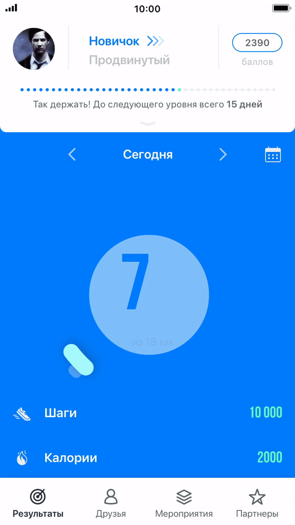
- I created a dropdown element that shows detailed user statistics in a playful style. Using great animation, this dropdown shows their current progress and the important actions needed to upgrade to the next level.
- The main element, the progress bar, could transform into Fitty, cheering the runner up or showing important messages.
- There were also special success animations that appeared to celebrate an achievement.
As a result of these and other design solutions, I brought a native and cheering experience to runners, making the competition more pleasurable.
Animations
I worked with a motion designer, who animated the interactions. I did not create the animations below, and I’ve included them to give a more complete perspective of the final work.
🔥 Ready, Steady, Go
The app was successfully launched in February 2019 and became an official app for Green Marathon.
It was presented to over 170,000 athletes in 60 cities across the country. They could use it to prepare for the Green Marathon, register for the event, and compete.
As for me, my approach was appreciated by the client, and we have moved forward to a new project.
Find some more about this project on Behance.