Dom.ru My Account
A mobile app that kept track of account changes for one million customers of Dom.ru, the second largest provider in Russia.
How it started
Dom.ru is the second-largest internet provider in Russia. In 2017, it offered internet, cable TV, home phones, mobile services, and city-sized Wi-Fi networks. We became involved because it had decided to build a mobile app as an all-in-one hub, allowing users to keep track of account changes, the latest offers, and much more.
Our agency was hired to design and develop this promising product.
Goal
The goal for this mobile app was to become the key touchpoint of the customer experience. Our aim was to convert all the functions of the web interface into a lightweight app that could be used by inexperienced users.
I was responsible for the whole user experience and the user interface. I worked with a motion designer, a visual designer, a project manager, and a group of developers. Moreover, I headed the design process. My role was to inspire our team and make things easy for them.
Research
I started the process by making a business trip to Perm to visit the client’s headquarters. I worked on-site with their team to determine the goals for the product. I met with several internal teams to align the goals and to prioritize the features and workflow.
I then conducted some in-depth interviews to understand the customer’s needs and pain points. I did a competitive analysis to identify the best practices and common practices for telecom apps.
The final step in the research was to use the client’s services myself. Fortunately, my grandmother used Dom.ru services, so I used her account for a while. I was literally designing an app for my own granny.
Research results
After a few weeks of research, analysis, and brainstorming, we found some valuable insights, defined the project scope, chose the basic informational architecture, and produced some lo-fi mockups.
Here are a few of the research findings that I’d like to share:
No Passwords
One key discovery in the interviews with some users was that they accessed their accounts by restoring their credentials. This was because they could not remember their account number.
Conclusion: The app should have an easier way to authorize users, e.g. by phone number instead of by account number. This solution increased the conversion rate from installs to authorization, decreased the workload of the user support team, and increased user satisfaction.
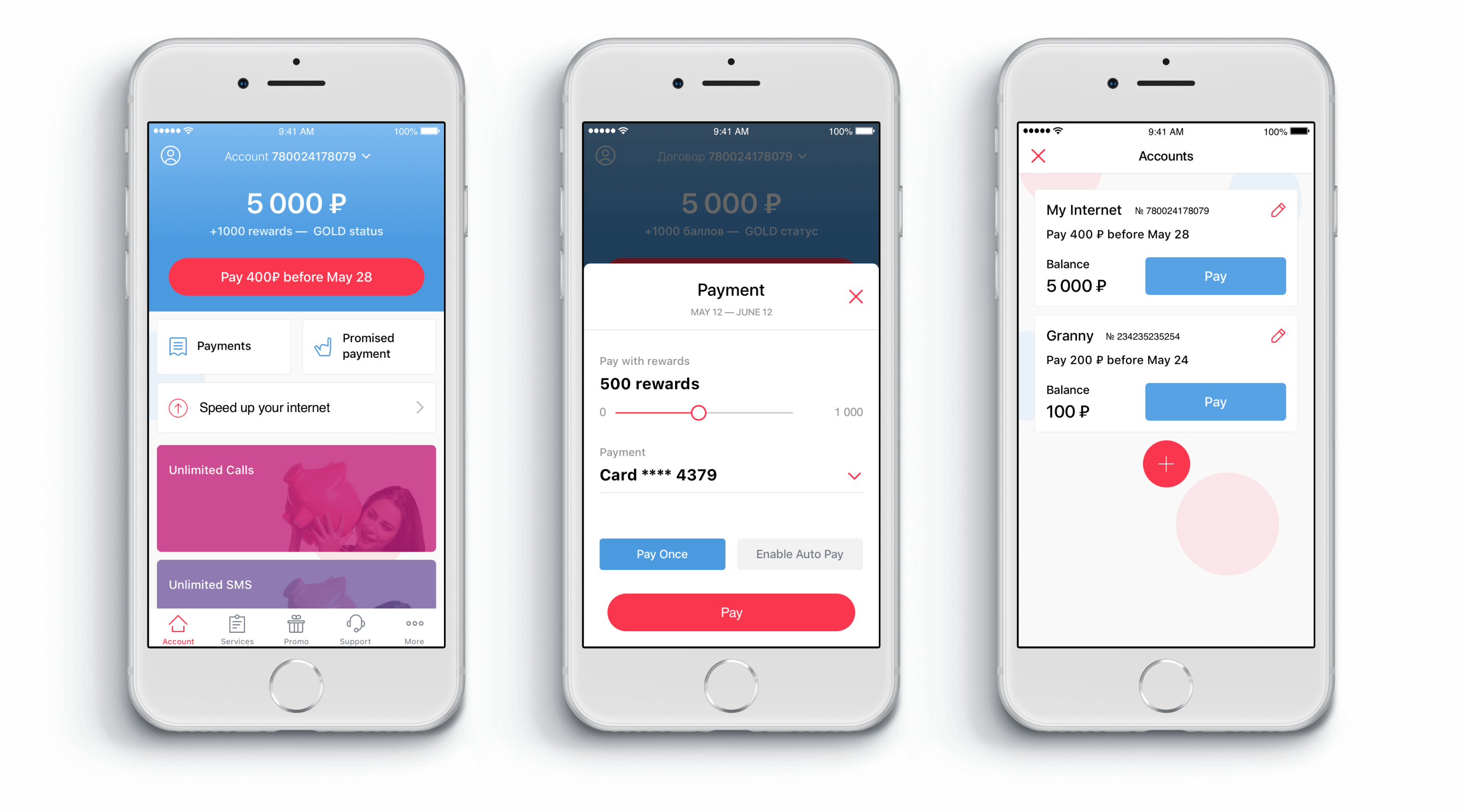
More Is Better
Many users had more than one contract with Dom.ru because they were paying for their parents or their children.
Conclusion: Users shouldn’t need to log out and log in again to check their second account. The app should support multi-account profiles.
Accelerate Retention
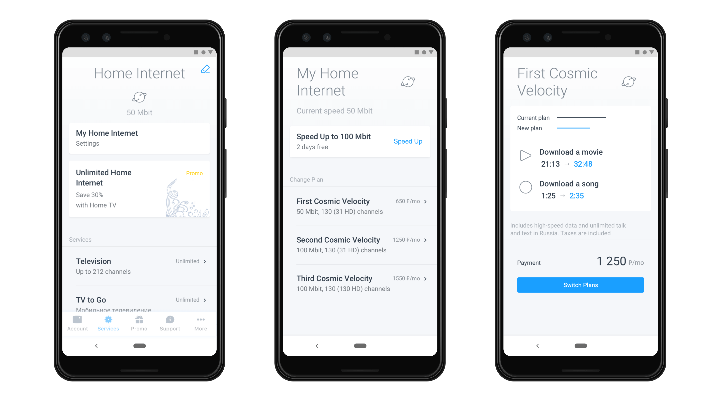
Dom.ru lets its users accelerate their internet access to the maximum speed for free for two days every month. This was the most popular use case (after payments) of the web account. However, many people didn’t even know about this feature.
Conclusion: The app would have an ‘accelerate’ button right on the first screen, making the experience smooth. This design solution increased retention and satisfaction.
Design process
We worked with the client’s team to identify the steps in the user lifecycle and to determine what features were necessary.
This is how it worked:
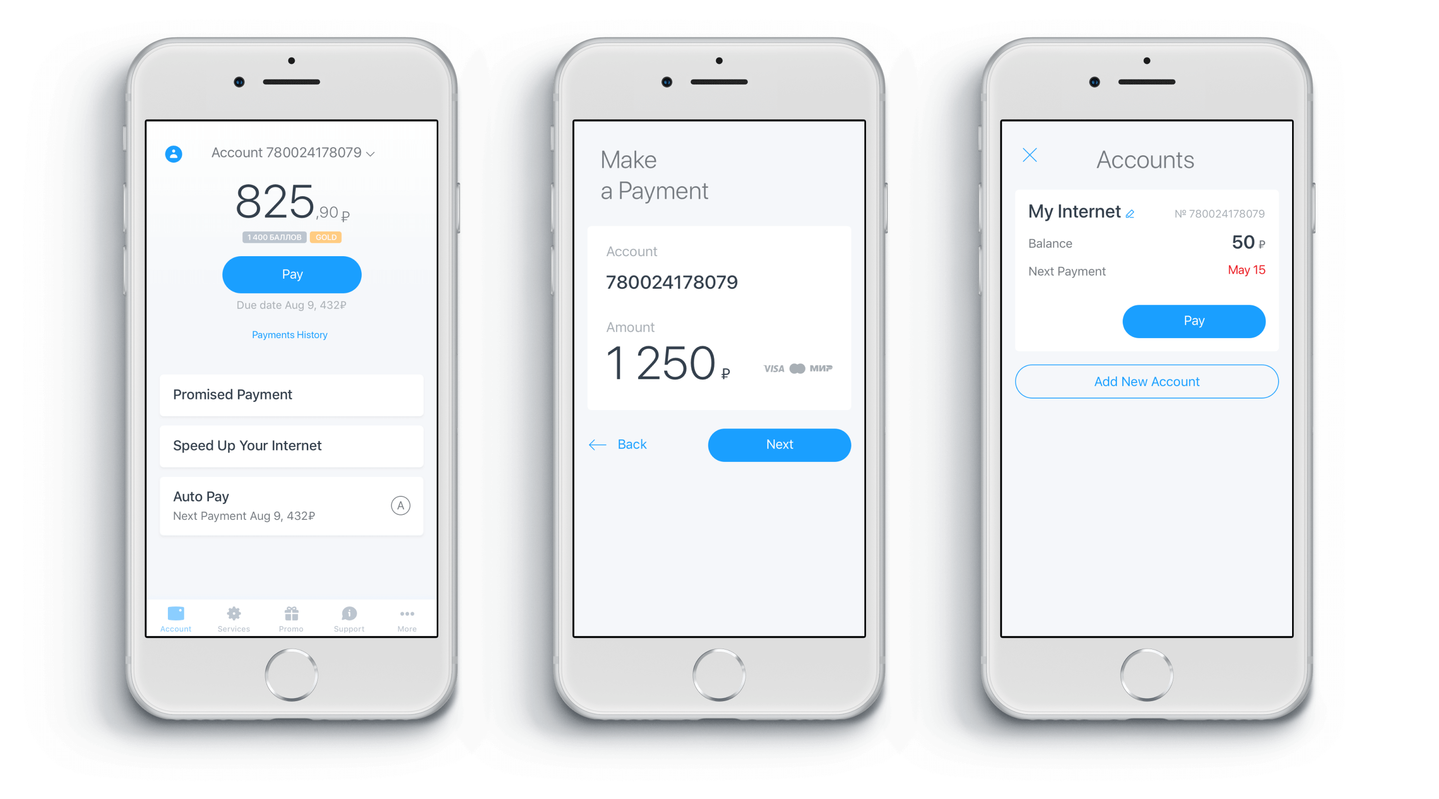
I suggested that we redefine the authorization process. A user would not need to remember their account number to access the app because authentication would be based on their phone number, which we could use as their account number, like this:
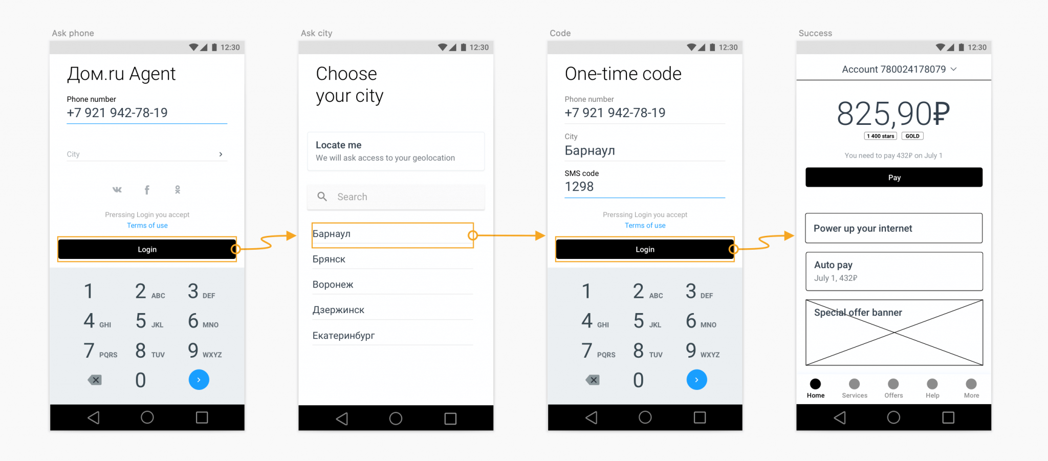
The original idea was that they would log in with their phone number and a one-time SMS code, but then we found that the client’s infrastructure couldn’t support this type of authorization process. So I designed a different process, in which a user logged in with their phone number and the classic password.
After a few iterations like this, the navigation in the app and the first high-fidelity mockups were approved by the client, and I moved further to visual concepts.
Visual concepts
We decided to create three unique design concepts and evaluate them by getting users to test them.
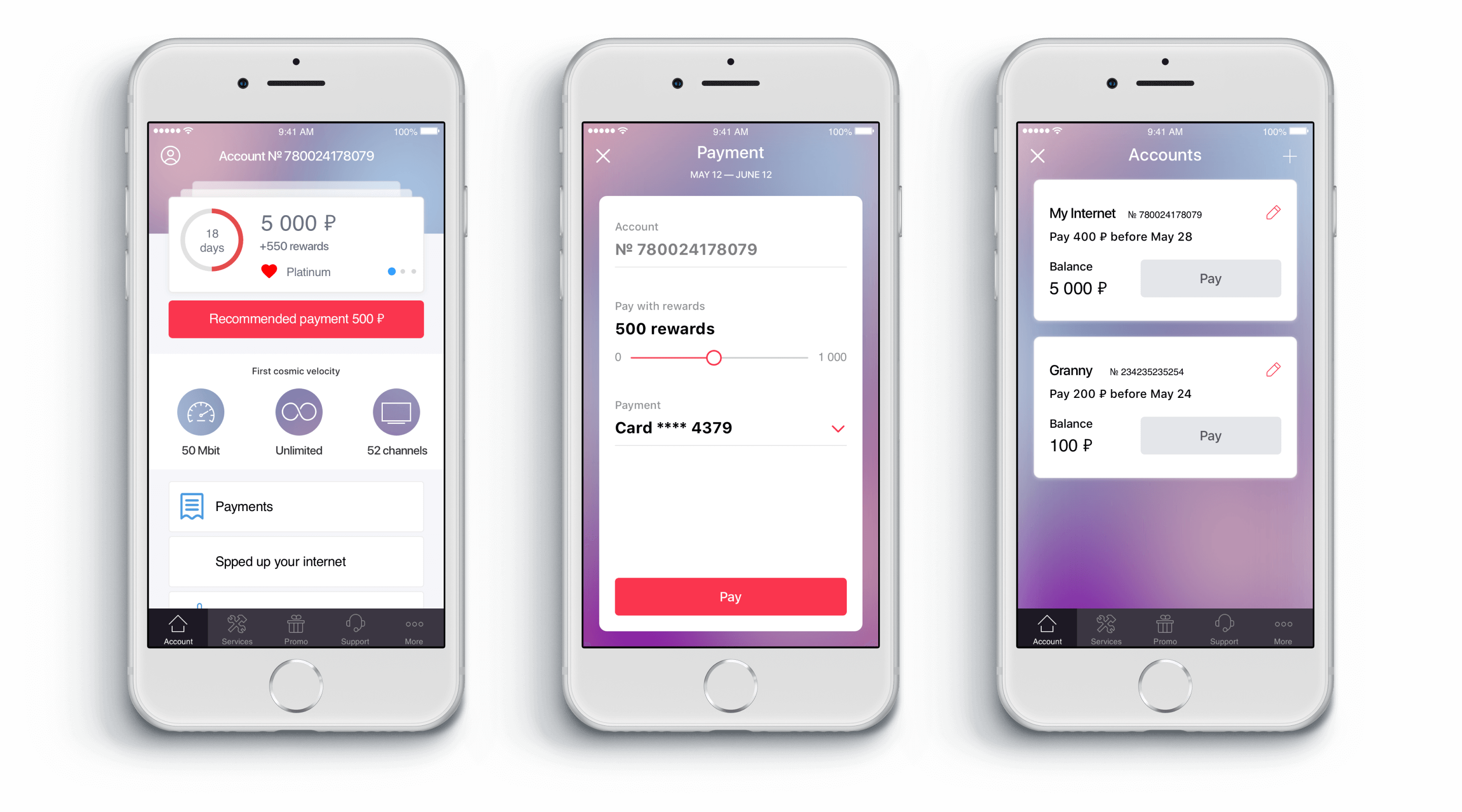
The client’s team ran tests with 15 respondents. The results were somewhat curious. The “sky” version (3) had the best overall rating, although the “blur” (2) one was the most popular. The client decided to continue with the “sky” version, even though it was less appealing.
While I was working on the new flows, the visual designer converted the existing flows to speed up the development. Moreover, the motion designer took some of the completed screens and designed a beautiful intro animation.

Results
The entire app was ready in seven months, complete with animations, UI kit, Android and iOS style guides, and a happy focus group.
The app was launched in 2018. It gained a high rating of 4+ in Google Play.
But the most important thing was that more than one million users had control of payments and services at their fingertips! The app helped customers make payments on time and without delays, resulting in significant business growth.
Find some more about this project on Behance,